- No extra element (only the
<img>tag) - No pseudo-element
- Less than 15 CSS declarations
<img> tag)
All the below are the same. You can save up to 32 chars!
]]><img> tag)
<img>)
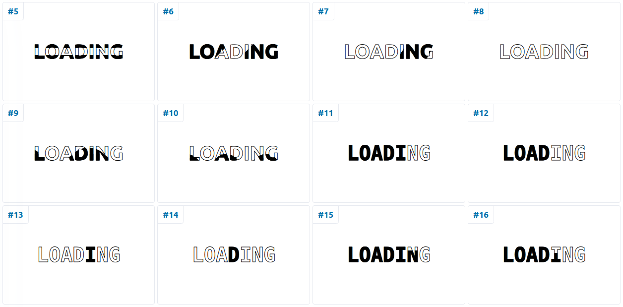
One example:
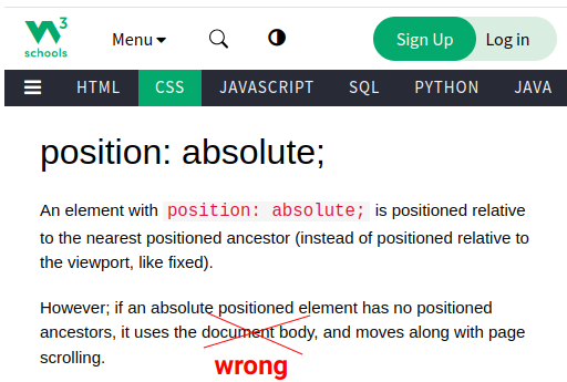
]]>position: absolute element.
"if an absolute positioned element has no positioned ancestors, it uses the body element" NO, this is false!
The W3Schools page is showing a wrong information but the MDN page is showing the correct one.
 |
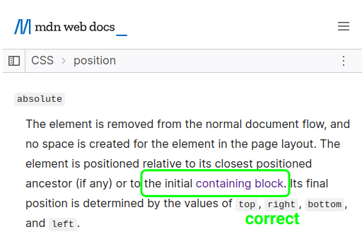 |
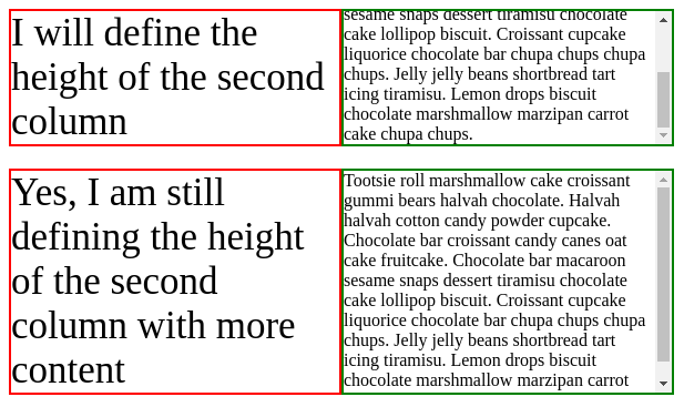
What is the initial containing block?
It's a rectangle having the same dimension as the viewport (full width/height) and anchored at the canvas origin (moves on scroll). In other words, it's similar to the viewport but moves if we have scrolling.
Here is a demo to illustrate:
]]>height: auto
]]>It's possible to remove the unit from any CSS value to get an integer!
⚠️ A hacky experimentation to use with caution ⚠️
]]>No more JavaScript to do this. A few lines of CSS, one HTML element and you can update any value in real time.
]]><progress> tag)@property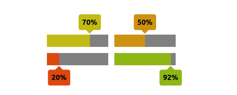
It's a Chrome-only experimentation:
]]>@property and math functions
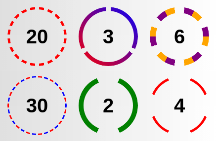
Adjust the below to get your quantity query selector!
]]>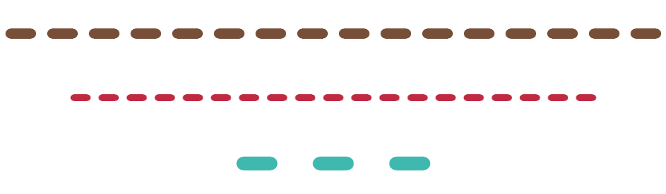
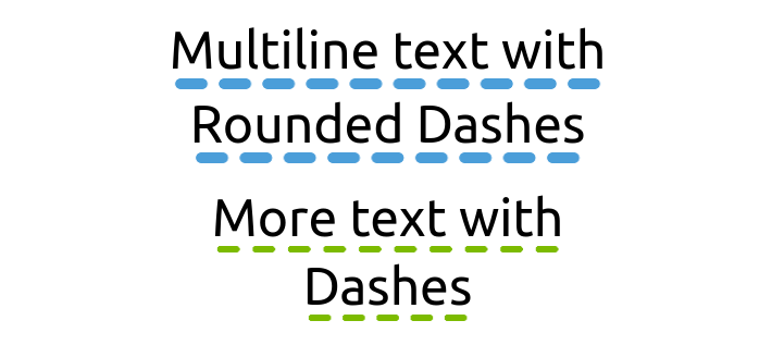
Code available here: css-shape.com/rounded-dashes
Resize the below demo to notice the responsive part
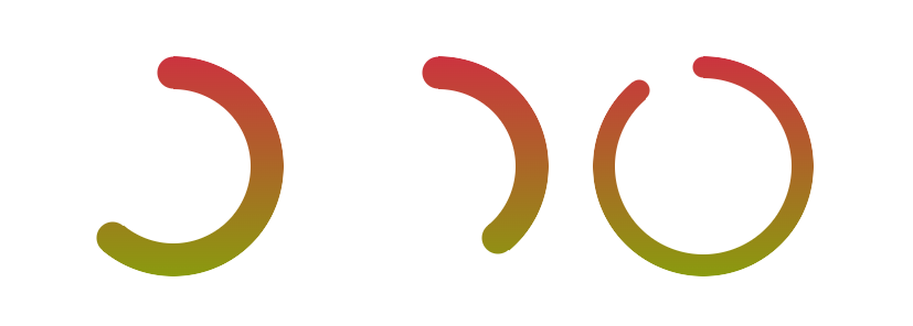
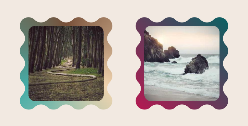
]]>css-generators.com/wavy-circle
<img> element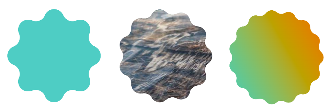
Related: css-tip.com/wavy-circle
]]>
:root level.
]]>@propertyself inside the scroll() value.
]]>:root level (avaiable to all the elements)font-size of your website using modern CSS features.
:root!
Use the @property instead and create "Typed CSS Variables"
Instead of doing this:
]]>@property & trigonometric functions
⚠️ There is no implementation yet, but it's good to know.
]]>
<progress> tag)@property
It's a Chrome-only experimentation:
]]>
clip-path: polygon(). An easy way to create Cut-out shapes.
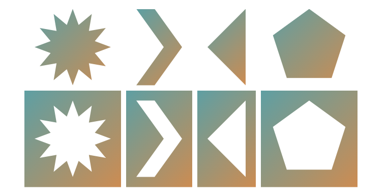
Powered by modern CSS features:
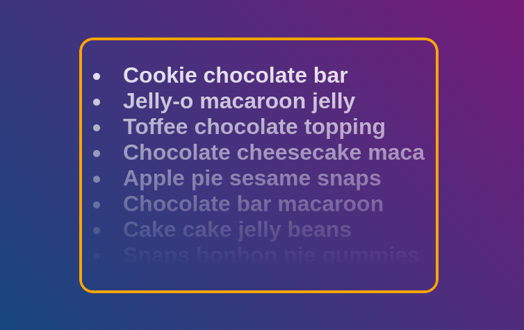
@property & CSS variablestext-wrap. No more lonely words at the end of paragraphs, and titles will look much better.
]]>
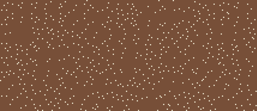
You can also surprise yourself with a random CSS Pattern!
<input> element)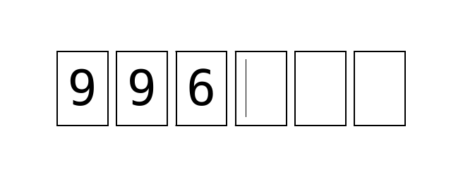
Only one gradient and you can easily get the border-only variation.
Useful when you want to do some color manipulation.
]]>html element, you either use "html{}" or ":root{}" but thanks to CSS nesting you can simply use "&{}"
When used alone, the nesting selector will match the root element!
A one-character selector 🤯
⚠️ It has a lower specificity than html and :root
]]><img> tag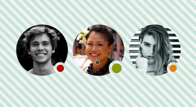
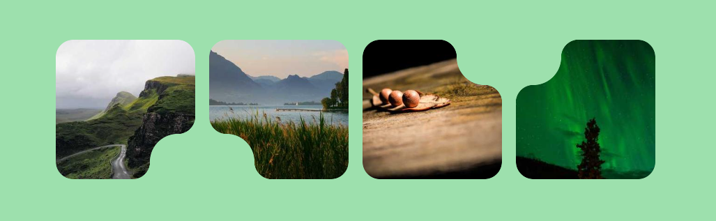
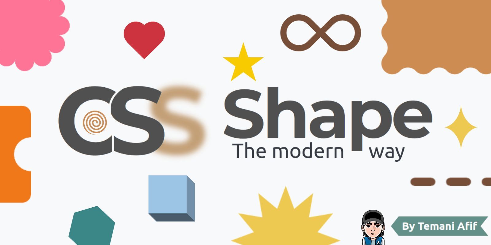
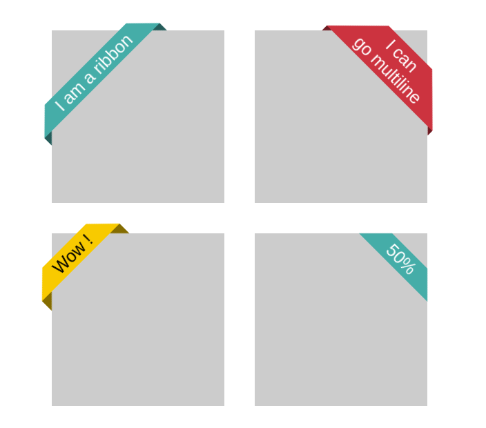
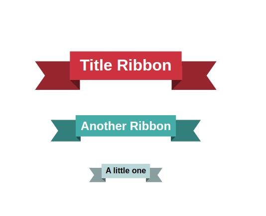
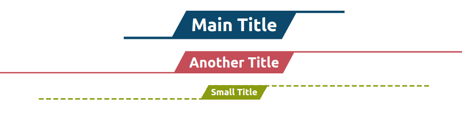
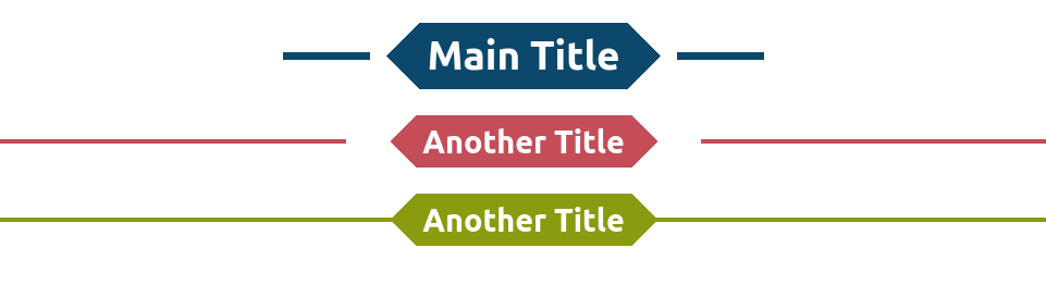
The modern way to create CSS Shapes
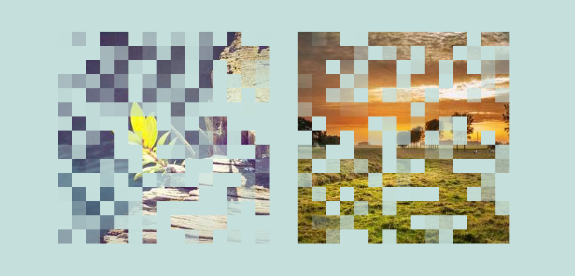
Here is an example of a CSS code with a lot of redundancy
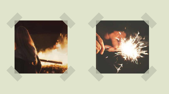
]]><img> tag)⚠️ Not suitable for touch screen (the sharp edges may hurt you) use wavy borders
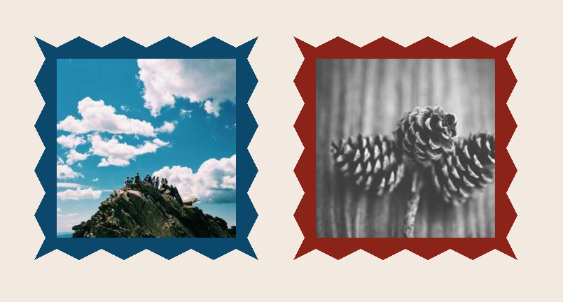
Three different codes to create the same shape
<img> tag)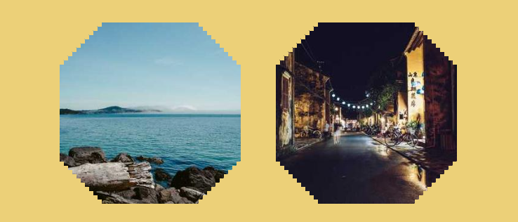
round() function and create a fluid typography with a discrete function instead of a continuous one.
Define the step and get precise values within a specific range. Very useful if you have some calculation based on the font-size like using the em unit. No more rounding issue!
<img> tag. Powered by CSS Mask, @property and optimized with CSS mask
The rotation will resume slowly on mouse-out as well.
]]>animation-composition and a few lines of code
<img> tag)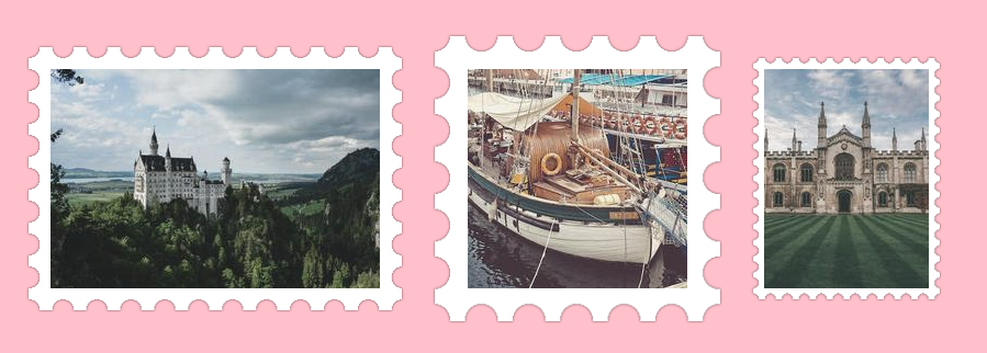
@property, animation-composition and more)
<img> tag)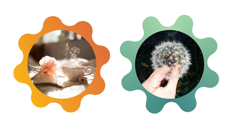
align-content that works with block-level elements, but pay attention when you want to center elements such as <img>, <iframe>, <canvas>, <video>, etc.
⚠️ They won't get centered ⚠️
They will look centered but in reality, they are not and this is not a bug!
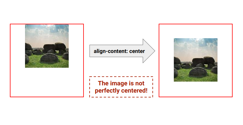
Images and similar inline-level elements have that strange white space under them due to the default baseline alignment, and that space is preserved when using align-content because we align the "whole content"
So don't forget to get rid of that space using vertical-align: top
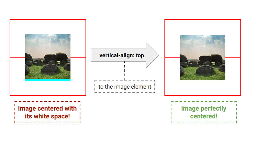
That space may look small but it can make a difference especially if you use a big font-size.
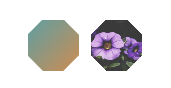
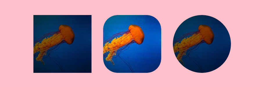
This is the case with circle() and ellipse() of clip-path. No need to provide any argument and they will, by default, round your element. circle() is a particular case of the ellipse() and is useful with square elements.
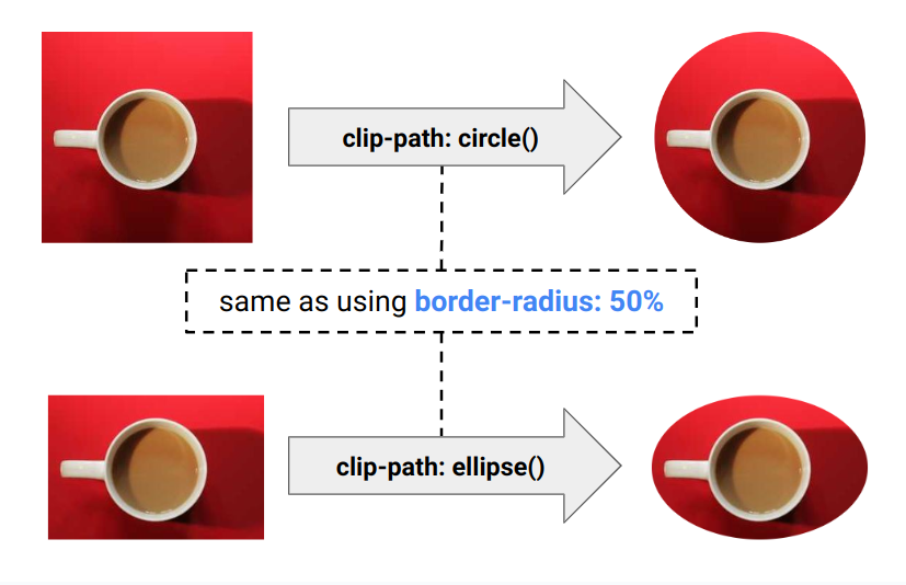
The browser will default circle() to circle(closest-side at center) and ellipse() to ellipse(closest-side closest-side at center)
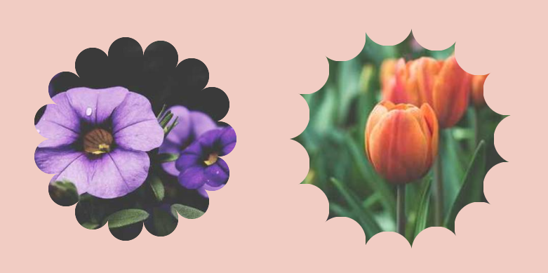
css-generators.com/flower-shapes
Get an optimized code in no time. Adjust the setting and then click!
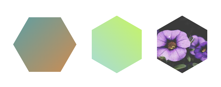
More CSS Shapes: css-shape.com
]]>⚠️ "&" in CSS is different from the one in Sass ⚠️
Your Sass code won't work the same way if you use it as a CSS code.
The below code won't give the same result when used with CSS Nesting and Sass
]]><img> tag)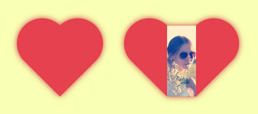
<img> tag)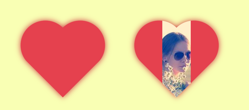
aspect-ratioclip-path (with a 3-point polygon)That's it, and it works with any kind of elements including images.
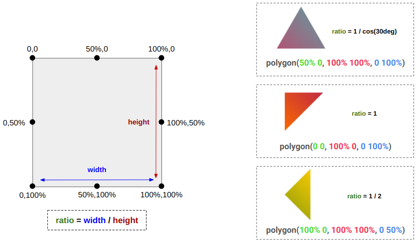
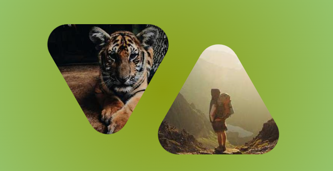
Get the CSS code from: css-generators.com/triangle-shapes
]]>All of this, using only 3 properties and easy to control with CSS variables
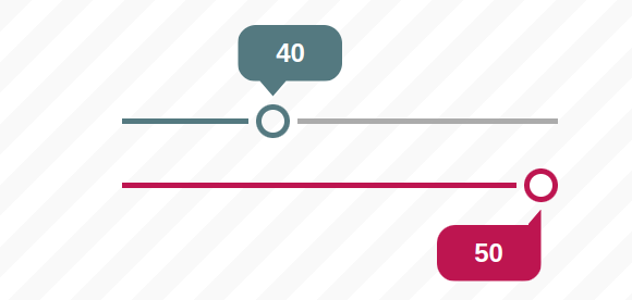
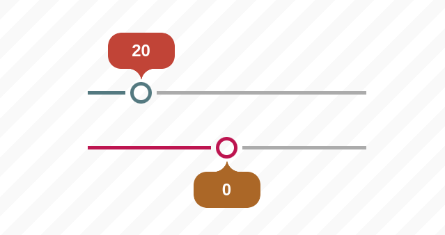
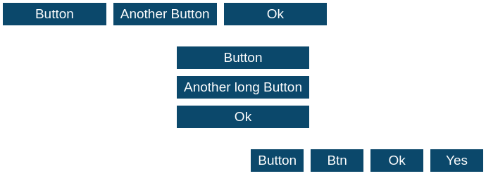
min() or max()? You always struggle to know which one to use and you end up trying both until one of them works.
💡 Here is a figure to help you decide when to use them
You start with clamp() then:
max()min()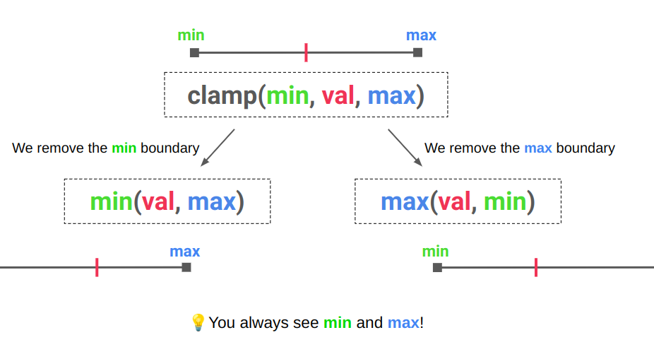
If you want to set a max-width to your element then it's min()
width: clamp(min,100%,max) ➞ width: min(100%, max)
border-image and add as many borders as you want to your images for a fancy decoration
<img> tag)round() function 🥳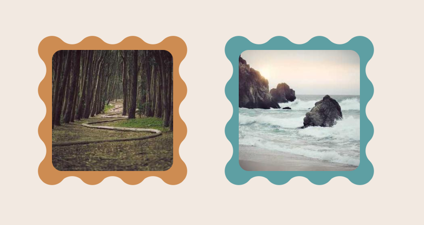
<img> tag)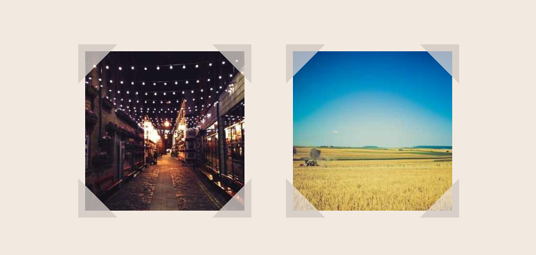
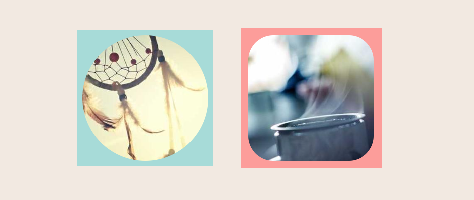
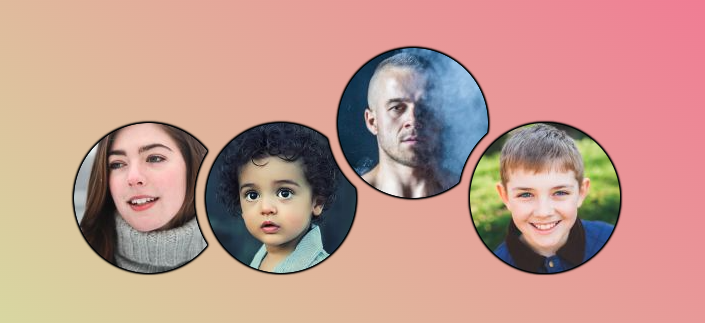
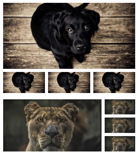
Another list of stacked avatars using the same code structure
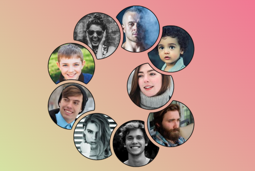
Still using only the <img> tag (No extra elements, No pseudo-elements) and a touch of magic 🪄
<img> tag)
<img> tag)
<img> tag)
<img> tag)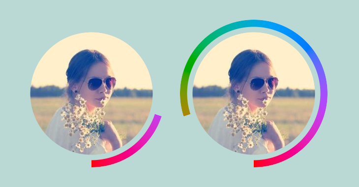
<img> tag)
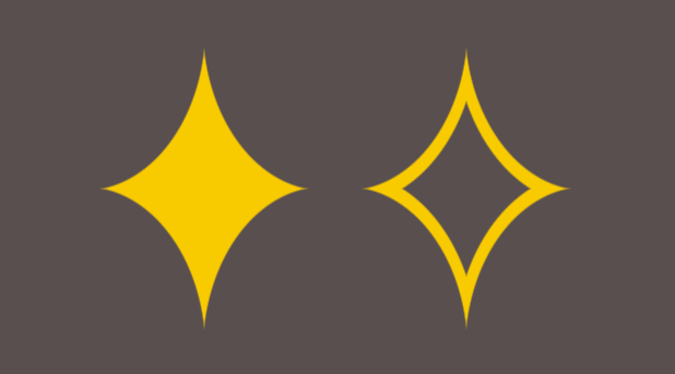
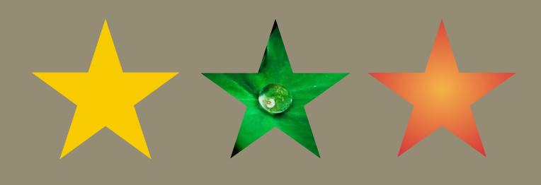
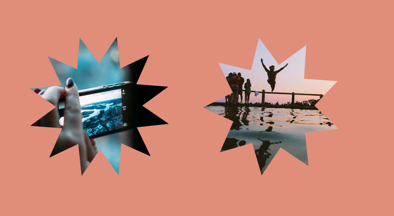
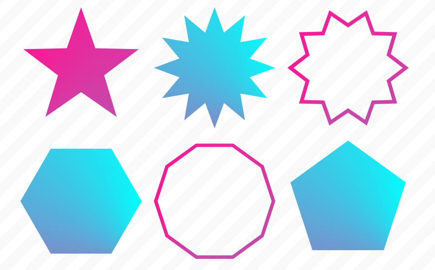
<img> tag)Get the code in no time using an Online Generator for Starburst Shape
<img> tag)
<img> tag)@property
<img> tag)
<img> tag)
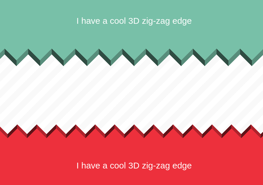
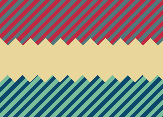
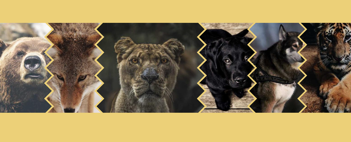
Zig-Zag edge generator 👉 css-generators.com/custom-borders
<img> tag)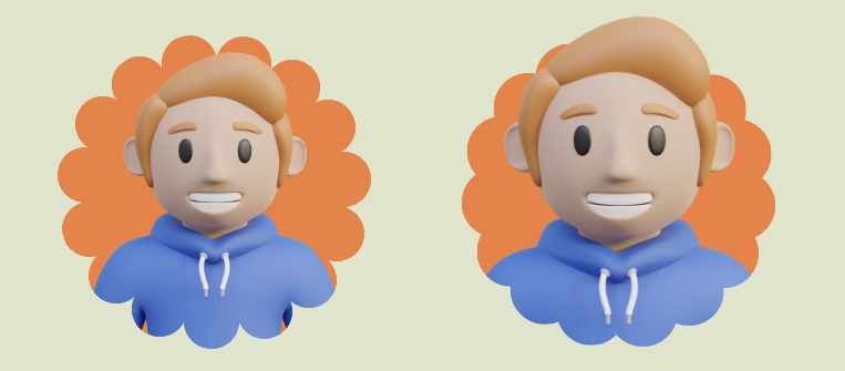
<img> tag)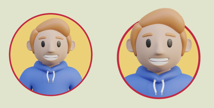
<img> tag)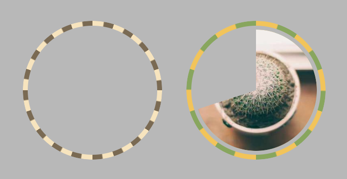
<input> tag)
<img> tag)
<img> tag)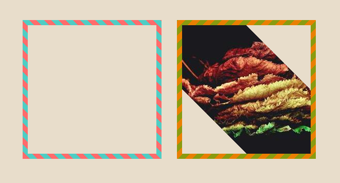
<img> tag)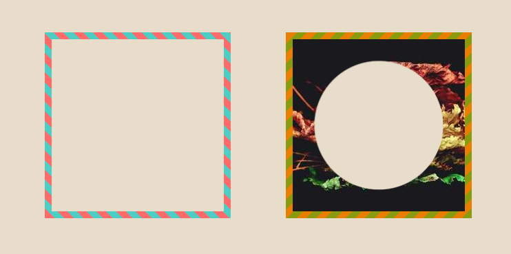
conic-gradient()
<img> tag)<img> tag)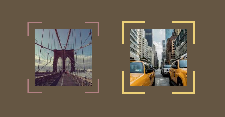
<img> tag)
<img> tag)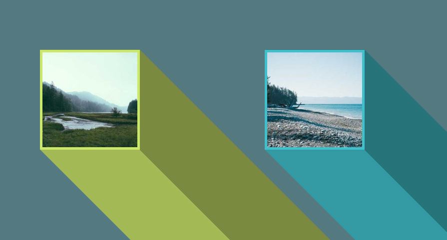
<img> tag)
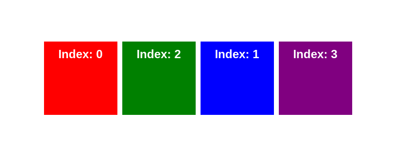
Use an index like any programming language to iterate through the array. Practical when you are already using an index for something else.
<img> tag)
<img> tag)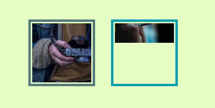
<img> tag)
<img> tag)
<img> tag)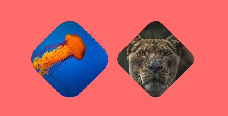
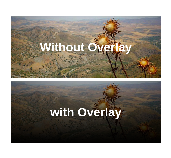
You can do it with border-image!
Only one line of code and you have your overlay 🤩
<img> tag)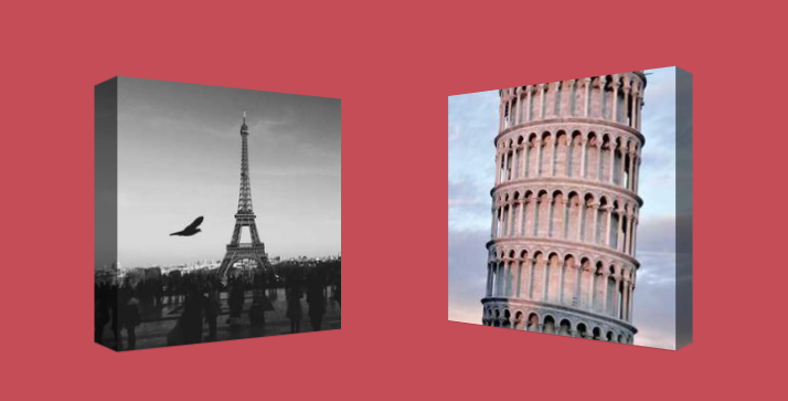
<img> tag)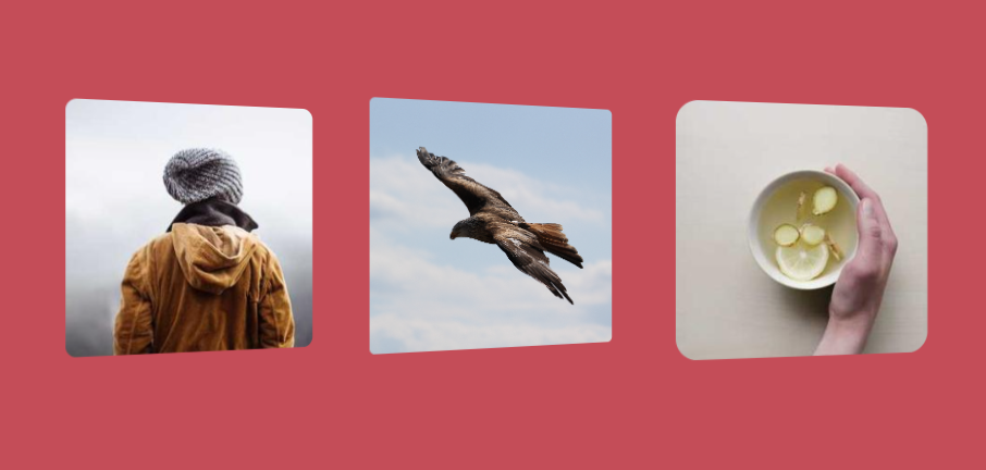
<img> tag)
<img> tag)object-fit and object-position<img> tag)Pay attention to the support of the @property.
@counter-style to customize your <ol> list with a simple code
counter()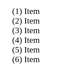
<input> element)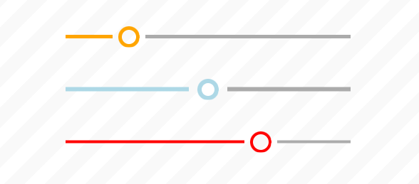
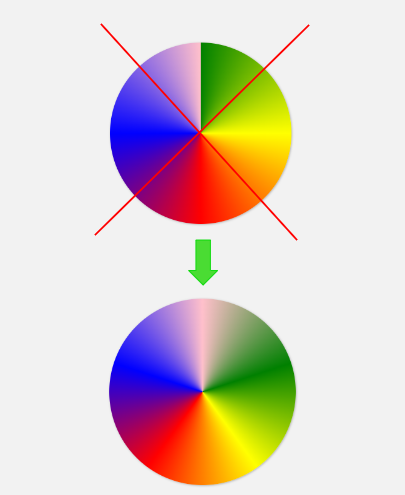
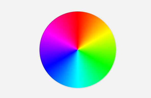
conic-gradient() and the new color interpolation to create a nice color wheel 🤩
border-radius and no need to know the value of border.
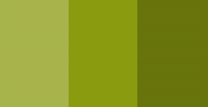
color-mix() to manipulate the Hue of a color in the HSL color space
]]>color-mix() to create different shades from one color.
Mix with ⚫️ black for a darker color and ⚪️ white for a lighter color
color-mix() function to create a color switch with a compact code
border-radiuscss-generators.com/gradient-shadows
border-radius
<img> tag)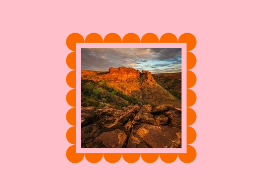
:has() selector and style your container based on its number of elements (direct children)
⚠️ It doesn't count text nodes. Only tags!
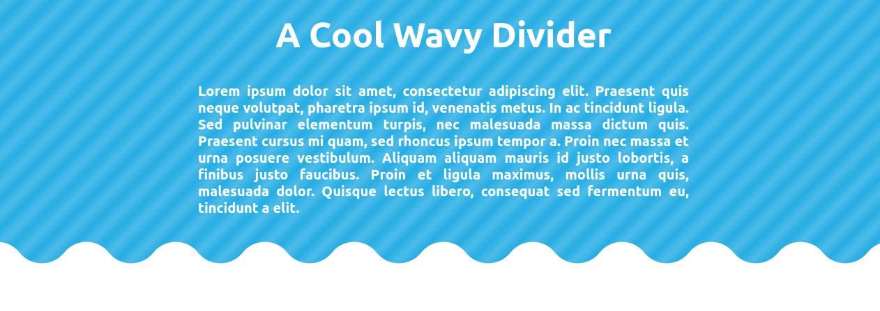
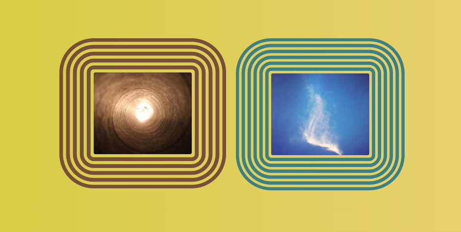
]]>Use an online generator to easily get the code: css-generators.com/wavy-shapes
<img>s inside a container)border-radius
Use an online generator to easily get the code: css-generators.com/custom-corners
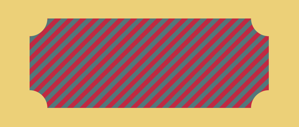
Use an online generator to easily get the code: css-generators.com/custom-borders
<img> tag)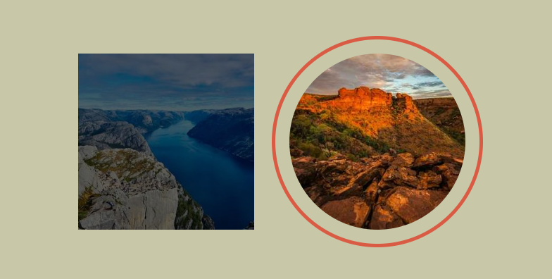
<img> inside a container)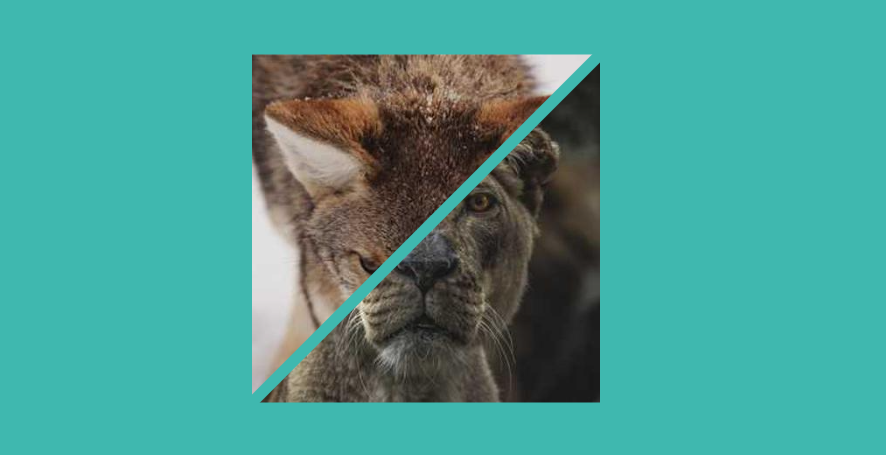
<img> tag)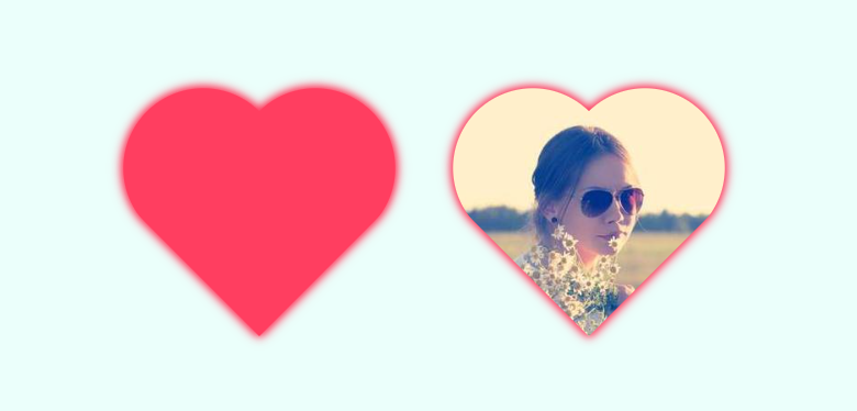
<img> tag)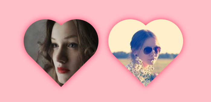
border-image
<div>!
Powered by CSS-in-SVG-in-CSS
]]>

<img> tag)You can also have a cool transition on hover
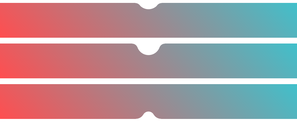
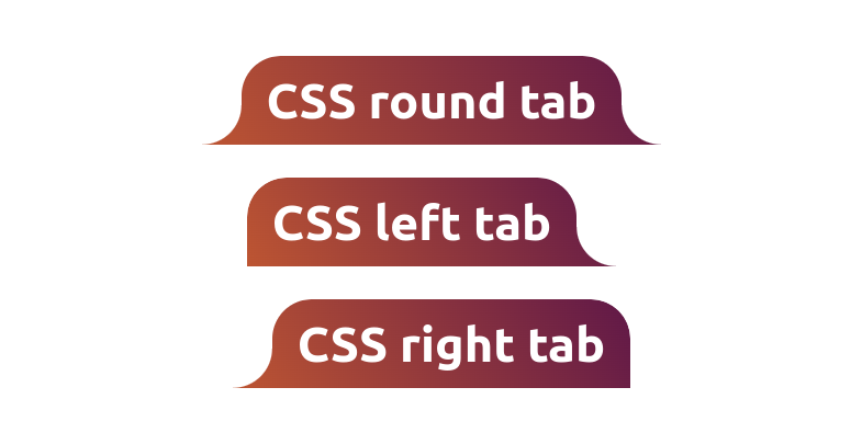
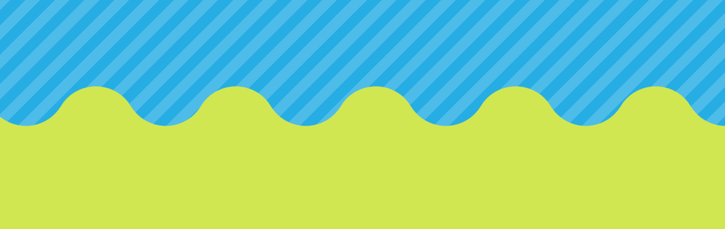
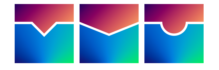
css-generators.com/section-divider
<img> tag)
<img> tag)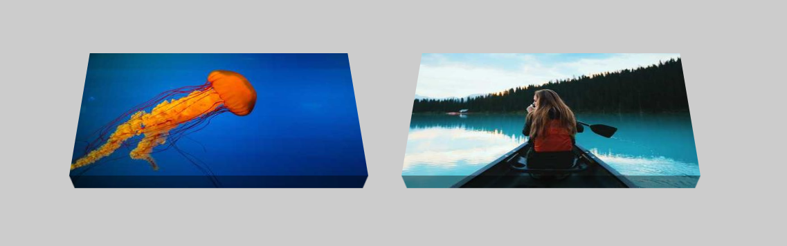
<div>
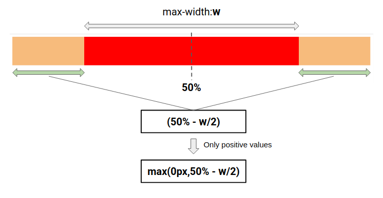
height:100%100vh<body>max-width and center your block element with one CSS declaration using margin-inline and max().
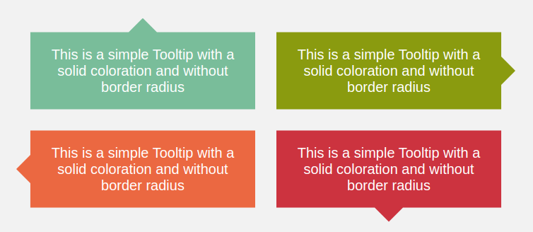
box-decoration-break: clone and CSS gradients.
Below, the left column will control the right column.
No JavaScript is needed, only three lines of CSS will do the job
You can also animate it on hover!