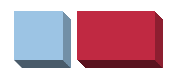
3D Box using Modern CSS
In a previous post, I created a simple 3D box using corner-shape and the border properties.
.box {
  --d: 30px; /* the depth */

  border-radius: 0 var(--d);
  corner-shape: bevel;
  border-right:  var(--d) solid #0004;
  border-bottom: var(--d) solid #0008;
  background: #9CC4E4;
}
We can improve the code by introducing more variables to control the angle and the perspective. A good use case for modern CSS features such as if(), @property, math functions, etc.

@property --_i {
  syntax: "<number>";
  inherits: false;
  initial-value: 0;
}
.box {
  --d: 30px;  /* the depth */
  --a: 45deg; /* the angle */
  --p: 1.2;   /* the perspective */

  --_a: mod(var(--a),360deg);
  --_i: round(down,var(--_a)/90deg);
  --x: abs(cos(var(--_a))*var(--d));
  --y: abs(sin(var(--_a))*var(--d));
  corner-shape: bevel;
  border-style: solid;
  border-color: #0002 #0004 #0008 #0004;
  background: #9CC4E4;
  border-width: if(
     style(--_i: 0): 0 0 var(--x) var(--y);
     style(--_i: 1): var(--x) 0 0 var(--y);
     style(--_i: 2): var(--x) var(--y) 0 0;
     style(--_i: 3): 0 var(--y) var(--x) 0;
    );
  border-radius: if(
     style(--_i: 0): var(--y) 0 calc(var(--p)*var(--y)) 0/calc(var(--p)*var(--x)) 0 var(--x) 0;
     style(--_i: 1): 0 calc(var(--p)*var(--y)) 0 var(--y)/0 var(--x) 0 calc(var(--p)*var(--x));
     style(--_i: 2): calc(var(--p)*var(--y)) 0 var(--y) 0/var(--x) 0 calc(var(--p)*var(--x)) 0;
     style(--_i: 3): 0 var(--y) 0 calc(var(--p)*var(--y))/0 calc(var(--p)*var(--x)) 0 var(--x);
    );
}
Here is an interactive demo where you can adjust the 3 variables:
See the Pen 3D box with modern CSS by Temani Afif (@t_afif) on CodePen.
⚠️ Limited support (Chrome-only for now) ⚠️
Inspired by codepen.io/amit_sheen/full/yyeeJKO
More CSS Tips
- Conditional Border Radius with Modern CSS A simple trick to control the border-radius based on the screen/container size.
- Dynamic Tooltip Position with Anchor Positioning A tootlip that follows its anchor while adjusting the position of its tail.
- Why :is(::before,::after) doesn't work? Learn why the :is() selector doesn't work with pseudo-elements.
- 100 Ways to Center an element Horizontally and Vertically Explore all the possible ways to center a single element within a container.