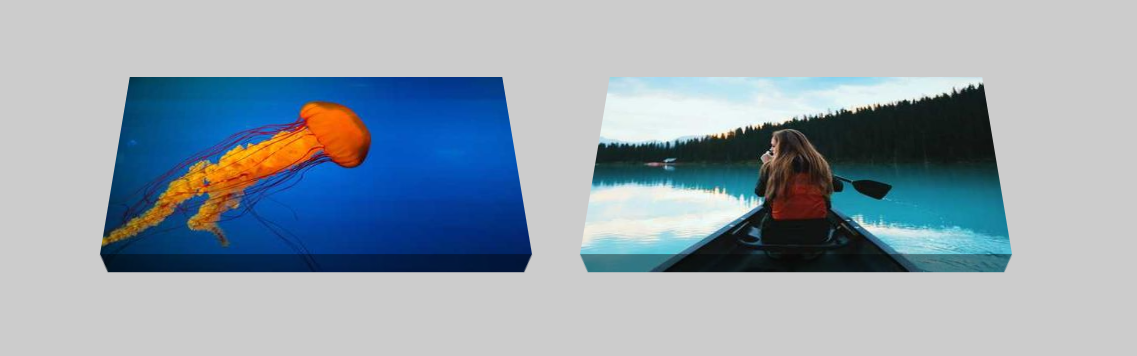
3D effect on images
Add a 3D effect to your images with a few lines of code:
- No extra element (only the
<img>tag) - No pseudo element
- No duplicated image
- A cool animation on hover
img {
  /* adjust the below to control the 3D effect */
  --x: 10px;
  --y: 20px;
  transform: perspective(1000px) rotateX(var(--_a,40deg));
  /* */

  clip-path: polygon(
     var(--y)              var(--y),
     calc(100% - var(--y)) var(--y),
     calc(100% - var(--y)) calc(100% - var(--y)),
     calc(100% - var(--y) - var(--x)) var(--_c,100%),
     calc(var(--x) + var(--y))        var(--_c,100%),
     var(--y)        calc(100% - var(--y))
     );
  outline: var(--y) solid rgba(0,0,0,0.4);
  outline-offset: calc(-1*var(--y));
  padding: var(--y) var(--y) 0 var(--y);
  transition: 1s;
}
.box:hover img {
  --_a: 0deg;
  --_c: calc(100% - var(--y));
}
See the Pen CSS only 3D effect image by Temani Afif (@t_afif) on CodePen.
More detail: dev.to/afif/3d-image-with-one-element-1c87
More CSS Tips
- Section divider Use clip-path and CSS mask to create a section divider.
- Grid with dashed lines Two gradients to create a grid with dashed lines.
- A single-element spinner loader A mask trick to create a simple CSS loader with a single element.
- A rounded & dashed underline A combination of gradients to create a rounded dashed underline.