Direction-Aware Arrow Shape using corner-shape
We can use the new corner-shape to draw different CSS Shapes. And since it relies on border-radius, we can use the logical properties to create a direction-aware arrow that adjusts based on both the direction and the writing mode.
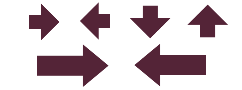
.arrow {
  --h: 80px; /* head */
  --t: 50px; /* tail */

  inline-size: calc(var(--h) + var(--t));
  block-size: calc(2*var(--h));
  border-start-start-radius: var(--t);
  border-end-start-radius: var(--t);
  border-start-end-radius: var(--h);
  border-end-end-radius: var(--h);
  corner-start-start-shape: notch;
  corner-end-start-shape: notch;
  corner-start-end-shape: bevel;
  corner-end-end-shape: bevel;
}
See the Pen Direction-aware arrow shape by Temani Afif (@t_afif) on CodePen.
The code can be less restrictive and more flexible if you want to consider only the direction and keep a horizontal writing mode.
.arrow {
  --h: 80px; /* head */
  --t: 45px; /* tail */

  width: 200px;
  height: 140px;
  border-start-start-radius: calc(100% - var(--h)) var(--t);
  border-end-start-radius: calc(100% - var(--h)) var(--t);
  border-start-end-radius: var(--h) 50%;
  border-end-end-radius: var(--h) 50%;
  corner-start-start-shape: notch;
  corner-end-start-shape: notch;
  corner-start-end-shape: bevel;
  corner-end-end-shape: bevel;
}
See the Pen Direction-aware arrow shape (less restrictive) by Temani Afif (@t_afif) on CodePen.
More CSS Tips
- The Hidden Selectors of The HTML Element Discover alternative selectors for the html element beyond the classic :root{} and html{}.
- Gallery of Skewed Images with Hover Effect Using modern CSS and corner-shape to add a fancy gallery of images with a reveal hover effect.
- Responsive Circular List of Stacked/Overlapping Images Images placed around a circle with a slight overlap and a nice hover effect.
- Responsive List of Stacked/Overlapping Images A few lines of modern CSS to create a horizontal list of responsive stacked images.