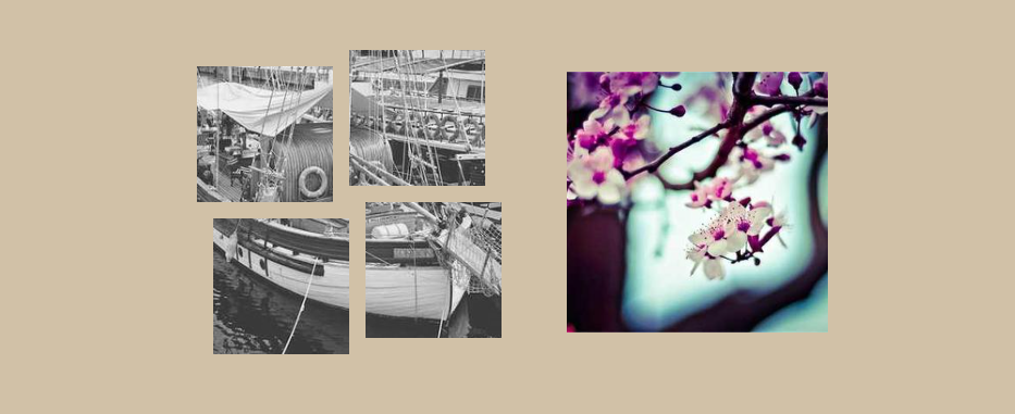
Split and assemble an image using CSS mask
Split an image into pieces using the mask property, then show it fully on hover. A single-element implementation using less than 10 CSS declarations.
img {
  --g: 15px; /* control the gap */

  width: 280px;
  aspect-ratio: 1;
  box-sizing: border-box;
  --_g: var(--g)/calc(50% - var(--g)) calc(50% - var(--g))
    no-repeat conic-gradient(#000 0 0);
  mask:
    left   var(--_i,) top    var(--_g),
    bottom var(--_i,) left   var(--_g),
    top    var(--_i,) right  var(--_g),
    right  var(--_i,) bottom var(--_g);
  transition: .3s linear;
}
img:hover {
  --_i: var(--g);
  padding: var(--g);
}
See the Pen Image assembly hover effect by Temani Afif (@t_afif) on CodePen.
Another simpler version without the moving effect:
img {
  --_g: 10%/45% 45% no-repeat conic-gradient(#000 0 0);
  mask:
    left   var(--_i,) top    var(--_g),
    bottom var(--_i,) left   var(--_g),
    top    var(--_i,) right  var(--_g),
    right  var(--_i,) bottom var(--_g);
  transition: .3s linear;
}
img:hover {
  --_i: 10%;
}
See the Pen Image mask hover effect by Temani Afif (@t_afif) on CodePen.
More CSS Tips
- The unknown behavior of flex-wrap flex-wrap doesn't only control the wrapping of items but also affects the alignment.
- Custom progress element using attr() Create a custom progress element with a dynamic coloration based on the value.
- Transparent inner border for images A simple code to add a fancy transparent inner border to image elements.
- Get the value of an input range (without JavaScript) Use modern features to get the value of an input range using only CSS.