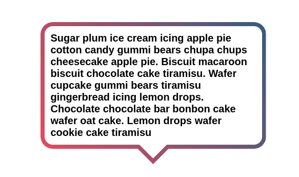
A border-only Tooltip using mask & clip-path
Create a border-only Tooltip with a few lines of code
- One element
- Support gradient coloration
- Support
border-radius - Optimized with CSS variables
.tooltip {
  /* triangle dimension */
  --a: 90deg; /* angle */
  --h: 1.5em; /* height */

  position: relative;
  z-index: 0;
}
.tooltip:before,
.tooltip:after {
  content: "";
  position: absolute;
  z-index: -1;
  inset: 0;
  background: linear-gradient(60deg,#E84A5F,#355C7D);  /* your coloration */
}
.tooltip:before {
  padding: 8px; /* the border width */
  border-radius: 1.2em; /* the radius */
  background-size: 100% calc(100% + var(--h));
  clip-path: polygon(0 100%,0 0,100% 0,100% 100%,
    calc(50% + var(--h)*tan(var(--a)/2) - var(--b)*tan(45deg - var(--a)/4)) 100%,
    calc(50% + var(--h)*tan(var(--a)/2) - var(--b)*tan(45deg - var(--a)/4)) calc(100% - var(--b)),
    calc(50% - var(--h)*tan(var(--a)/2) + var(--b)*tan(45deg - var(--a)/4)) calc(100% - var(--b)),
    calc(50% - var(--h)*tan(var(--a)/2) + var(--b)*tan(45deg - var(--a)/4)) 100%);
  mask: linear-gradient(#000 0 0) content-box,linear-gradient(#000 0 0);
  mask-composite: exclude;
}
.tooltip:after {
  bottom: calc(-1*var(--h));
  clip-path: polygon(
    calc(50% + var(--h)*tan(var(--a)/2)) calc(100% - var(--h)),50% 100%,
    calc(50% - var(--h)*tan(var(--a)/2)) calc(100% - var(--h)),
    calc(50% - var(--h)*tan(var(--a)/2) + var(--b)*tan(45deg - var(--a)/4)) calc(100% - var(--h) - var(--b)),
    50% calc(100% - var(--b)/sin(var(--a)/2)),
    calc(50% + var(--h)*tan(var(--a)/2) - var(--b)*tan(45deg - var(--a)/4)) calc(100% - var(--h) - var(--b)));
}
See the Pen Border-only Tooltip with a gradient coloration by Temani Afif (@t_afif) on CodePen.
More Tooltip shapes: css-generators.com/tooltip-speech-bubble
More CSS Tips
- Color switch using color-mix() Use the new color-mix() to create a simple color switch.
- CSS shapes: Polygon & Starburst Use online generators to create Polygon and Starburst shapes using clip-path.
- Card reveal animation A few mask tricks to create a fancy reveal animation on hover.
- Fancy Rounded frame around your images Combine gradients and CSS mask to create a fancy frame around an image.