Breakout Background using Modern CSS
Do you want to extend the background color of your element to the edge of the screen? A simple code using border-shape or border-image, and it's done!
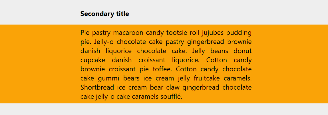
.breakout-background {
  border-shape: inset(0 -100vw) circle(0);
  border-color: #faa307;
}
⚠️ (Chromium only for now) ⚠️
See the Pen Breakout background using border-shape by Temani Afif (@t_afif) on CodePen.
How Does it Work? #
border-shape accepts two shape values (outer and inner); the border is rendered as the area between them. The outer shape is a rectangle that extends to the edge of the screen, and the inner shape is a zero-radius circle placed at the center. The idea is to make sure the inner shape is "nothing" to end with the outer shape fully filled.
Here is a demo with a transition on hover to better understand what's going on.
.breakout-background {
  border-shape: inset(0) circle(20%);
  border-color: #faa307;
}
.breakout-background:hover {
  border-shape: inset(0 -100vw) circle(0);
}
See the Pen Hover to extend! by Temani Afif (@t_afif) on CodePen.
Until better support, you can rely on border-image and one line of code:
.breakout-background {
  border-image: conic-gradient(#faa307 0 0) fill 0//0 100vw;
}
A line of code that we can optimize using the new image() function (more detail: How to correctly define a one-color gradient)
.breakout-background {
  border-image: image(#faa307) fill 0//0 100vw;
}
See the Pen Breakout background using border-image by Temani Afif (@t_afif) on CodePen.
More CSS Tips
- Responsive ASCII Arts using text-fit Thanks to a new CSS property, it's now easy to create responsive ASCII art.
- Responsive CSS Grid Layout with Animation A responsive grid with a smooth animation when the layout is updated.