CSS Shapes using corner-shape
Ready for the new corner-shape property? It allows you to manipulate the shape of the corners, and by simply adjusting the border-radius, you can create most of the common CSS shapes.
You can easily add borders to some shapes as well!
⚠️ Limited support (Chrome-only for now) ⚠️
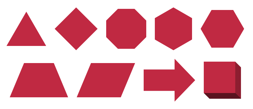
Triangles #
Isosceles triangles
.triangle {
  corner-shape: bevel;
  aspect-ratio: 1/cos(30deg);
  border-radius: 50%/100% 100% 0 0; /* OR 50%/0 0 100% 100% */
}
.triangle {
corner-shape: bevel;
aspect-ratio: cos(30deg);
border-radius: 0 100% 100% 0/50%; /* OR 100% 0 0 100%/50% */
}Right triangles
.triangle {
  corner-shape: bevel;
  border-[top|bottom]-[right|left]-radius: 100%;
}
See the Pen Triangle shapes using corner-shape by Temani Afif (@t_afif) on CodePen.
Rhombus #
.rhombus {
  border-radius: 50%;
  corner-shape: bevel;
  aspect-ratio: 1;
}
Octagon #
.octagon {
  border-radius: calc(100%/(2 + sqrt(2)));
  corner-shape: bevel;
  aspect-ratio: 1;
}
See the Pen Adding border to octagon and rhombus by Temani Afif (@t_afif) on CodePen.
Hexagon #
.hexagon {
  border-radius: 50% / 25%; /* OR 25% / 50% */
  corner-shape: bevel;
  aspect-ratio: cos(30deg); /* OR 1/cos(30deg) */
}
See the Pen Hexagon shapes (with border!) by Temani Afif (@t_afif) on CodePen.
Trapezoid & Parallelogram #
.trapezoid {
  border-radius: 80px / 100% 0 100% 0;
  corner-shape: bevel;
}
.parallelogram {
  border-radius: 80px / 100% 100% 0 0;
  corner-shape: bevel;
}
See the Pen Trapezoid & Parallelogram by Temani Afif (@t_afif) on CodePen.
Arrow #
.arrow {
  corner-shape: notch bevel bevel notch;
  border-radius: 60% 40% 40% 60%/25% 50% 50% 25%;
}
See the Pen Arrow shape by Temani Afif (@t_afif) on CodePen.
Cube & 3D box #
.cube {
  --d: 30px; /* control the depth */

  border-radius: 0 var(--d);
  corner-shape: bevel;
  border-right:  var(--d) solid #0004;
  border-bottom: var(--d) solid #0008;
  background: #9CC4E4;
}
See the Pen 3D box using corner-shape by Temani Afif (@t_afif) on CodePen.
More CSS Shapes: css-shape.com
More CSS Tips
- Dynamic Tooltip Position with Anchor Positioning A tootlip that follows its anchor while adjusting the position of its tail.
- Range Selection using Modern CSS A new way to select elements in a specific range using if() and sibling-index().
- 100 Ways to Center an element Horizontally and Vertically Explore all the possible ways to center a single element within a container.
- Circular Gallery of Rounded Images A fancy gallery of images created with few lines code.