CSS Graph paper pattern
Create a Graph Paper design using only 2 gradients
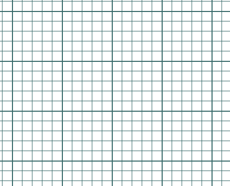
html {
  --s: 100px; /* control the size */

  --_g: #0000 90deg,#366 0;
  background:
    conic-gradient(from 90deg at 2px 2px,var(--_g))
     0 0/var(--s) var(--s),
    conic-gradient(from 90deg at 1px 1px,var(--_g))
     0 0/calc(var(--s)/5) calc(var(--s)/5);
}
See the Pen CSS only Graph Paper by Temani Afif (@t_afif) on CodePen.
More CSS Tips
- Extend your underline to the edge of the screen Use a border-image trick to create an overflowing underline.
- A CSS-only custom cursor Combine CSS and SVG to create any kind of fancy cursor.
- Wavy text animation II Use CSS gradients to create a wavy text animation.
- Wavy text animation Use CSS gradients to create a wavy text animation.