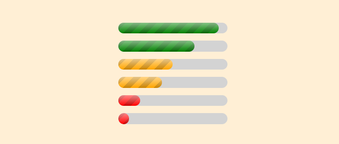
Custom progress element using attr()
Using the new attr() function, we can customize a progress element based on the progression. We can, for example, have a different coloration for each range of values! A single-element implementation without JavaSript.
progress[value] {
  --val: attr(value type(<number>));
  --max: attr(max type(<number>),1);

  --_p: calc(100%*var(--val)/var(--max)); /* the percentage of progression */
  --_b:
    /* if (p < 30%) "red" */
    conic-gradient(red    0 0) 0/max(0%,30% - var(--_p)) 1%,
    /* else if (p < 60%) "orange" */
    conic-gradient(orange 0 0) 0/max(0%,60% - var(--_p)) 1%,
    /* else "green" */
    green;
}
progress[value]::-webkit-progress-value {
  background: var(--_b);
}
progress[value]::-moz-progress-bar {
  background: var(--_b);
}
The support is still limited (Chrome-only for now)
See the Pen Progress bar with dynamic coloration by Temani Afif (@t_afif) on CodePen.
Here is another implementation where you can control the number of ranges and set the color for each one like an array.
progress[value] {
  --n: 4; /* number of ranges */
  --c: #F04155,#F27435,#7AB317,#0D6759; /* color for each range */
  /* N=4 so we have the following ranges [0% 25%[ [25% 50%[ [50% 75%[ [75% 100%] */

  --_v: attr(value type(<number>));
  --_m: attr(max type(<number>),1);
  --_i: round(down,min(99,100*var(--_v)/var(--_m)),100/var(--n));
  --_b: linear-gradient(var(--c)) no-repeat
     0 calc(var(--_i)*var(--n)*1%/(var(--n) - 1))/100% calc(1px*infinity);
}
progress[value]::-webkit-progress-value {
  background: var(--_b);
}
progress[value]::-moz-progress-bar {
  background: var(--_b);
}
See the Pen Progress bar with dynamic coloration by Temani Afif (@t_afif) on CodePen.
For better support check the following method: Progress bar with dynamic coloration
More CSS Tips
- Polygon shapes with rounded corners Use modern CSS and Sass to generate the code of rounded polygon shapes.
- Hexagon shapes with rounded corners Use the new shape() function to create a hexagon shape with rounded corners.
- Split and assemble an image using CSS mask A few lines of code to create a fancy reveal animation for images.
- An infinite logos animation Using the offset property to create a CSS-only infinite logos animation.