Direction-Aware CSS Shapes
Building on the previous idea, here is a more generic piece of code to make any CSS shape direction-aware. It relies on a few lines of well-supported CSS code.
.shape {
position: relative;
overflow: hidden;
}
.shape:before,
.shape:after {
content: "";
position: absolute;
width: 100%;
inset-block: 0;
translate: 100%;
/* Build your shape using whatever you want
clip-path: ...;
mask: ...;
background: url(...);
content: "👉";
*/
}
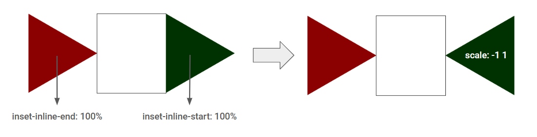
.shape:before {
inset-inline-end: 100%;
}
.shape:after {
inset-inline-start: 100%;
scale: -1 1;
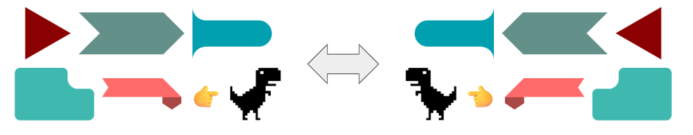
}Here are a few examples of shapes, mostly taken from css-shape.com. Adjust the direction and see how they behave:
See the Pen Direction-aware CSS shapes by Temani Afif (@t_afif) on CodePen.
How Does It Work? #
First, we create the shape using both pseudo-elements, which results in the same shape appearing twice.
.shape {
  position: relative;
}
.shape:before,
.shape:after {
  content: "";
  position: absolute;
  width: 100%;
  inset-block: 0;
  clip-path: polygon(0 0,100% 50%,0 100%);
}
Then, we place one pseudo-element with inset-inline-end: 100% and the other with inset-inline-start: 100%. Depending on the direction, they will get mapped to either left: 100% or right: 100%. We invert one of the shapes using scale: -1 1.
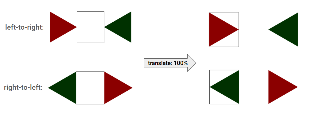
Both shapes are outside the element boundary, and they swap their position according to the direction. We translate both of them to the right using translate: 100% so that only one shape is inside the element boundary.
We hide the overflow, and it's done!
More CSS Tips
- Fizz Buzz using Modern CSS (no HTML) A fun experiment using modern CSS to create the classic Fizz Buzz.
- The Hidden Selectors of The HTML Element Discover alternative selectors for the html element beyond the classic :root{} and html{}.
- Dynamic Tooltip Position with Anchor Positioning IV A tooltip with a stretchy arrow that follows its anchor.
- Responsive Circular List of Stacked/Overlapping Images Images placed around a circle with a slight overlap and a nice hover effect.