The Fundamentals of CSS Alignment
While centering elements in CSS has become easy over time, there is still a lot of confusion around alignment in general. Let’s be honest, you always end up trying different combinations until it works, but you don’t really understand how it works, right?
Which property is for vertical alignment? align-content or align-items? Where should I add display: flex? Let’s add it everywhere! A height? Why do I need to define a height!? Maybe I should try with display: grid?
It’s time to clear all the confusion! Through this exploration, you will understand the logic behind all the alignment properties and how they work in each layout. It’s not another article about centering, we are going beyond!
Table of Contents
There is a quiz at the end. Try it before reading this article to test your skills!
The Alignment Theory #
We have too many properties for alignment, and it’s not easy to memorize all of them. We can enumerate around 10 different properties, and it can be very frustrating for beginners.
Just give me one property to align vertically and another to align horizontally. Done!
It’s time to kill this type of thinking and understand why CSS requires numerous properties for alignment. Prepare a cup of coffee (or two) and let’s get started!
In every CSS layout, we have two levels of alignment: content and item. For the item level, we can either align each item individually or apply the same alignment to all the items. We need properties for “content alignment”, “item alignment”, and “all items alignment”, so place-content, place-self, and place-items.
What’s the difference between “content” and “all items”?
Items refer to the elements you add to your code. If you have a container with 5 divs inside it, then those divs are the items. Content is more obscure, and its meaning depends on the layout. For now, keep in mind that we have something called “content” that we can align inside the container, and the items are aligned inside “content”.
When talking about alignment, we have two axes; horizontal and vertical so each of the previous properties can take up to 2 values. Alternatively, we can split them into 2 properties: align-* and justify-*. So place-* is the shorthand of align-* and justify-*.
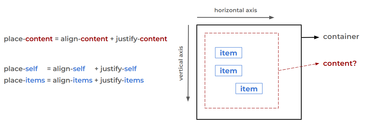
We will rarely use the place-* properties. The fact that they can take two values can be confusing, but they are useful if you want the same value for both axes. For example, to center an item, you can use place-self: center instead of justify-self: center and align-self: center.
- We have content level and item level alignment:
place-contentandplace-self. - Two axes:
align-*andjustify-*variations. - We can define the same alignment for all the items at once:
place-items(align-itemsandjustify-items). *-contentand*-itemsare defined on the container and*-selfare defined on the items.
Now we will see how those properties behave depending on the layout. Spoiler: They behave differently, and it’s gonna be a lot of fun! Did I tell you to prepare a cup of coffee?
Grid Container #
Let’s start with the grid layout, and the first thing to do is to identify what our “content” is. If you don’t know what “content” refers to, you may get lost so let’s start by understanding the anatomy of a grid layout.
Grid Anatomy #
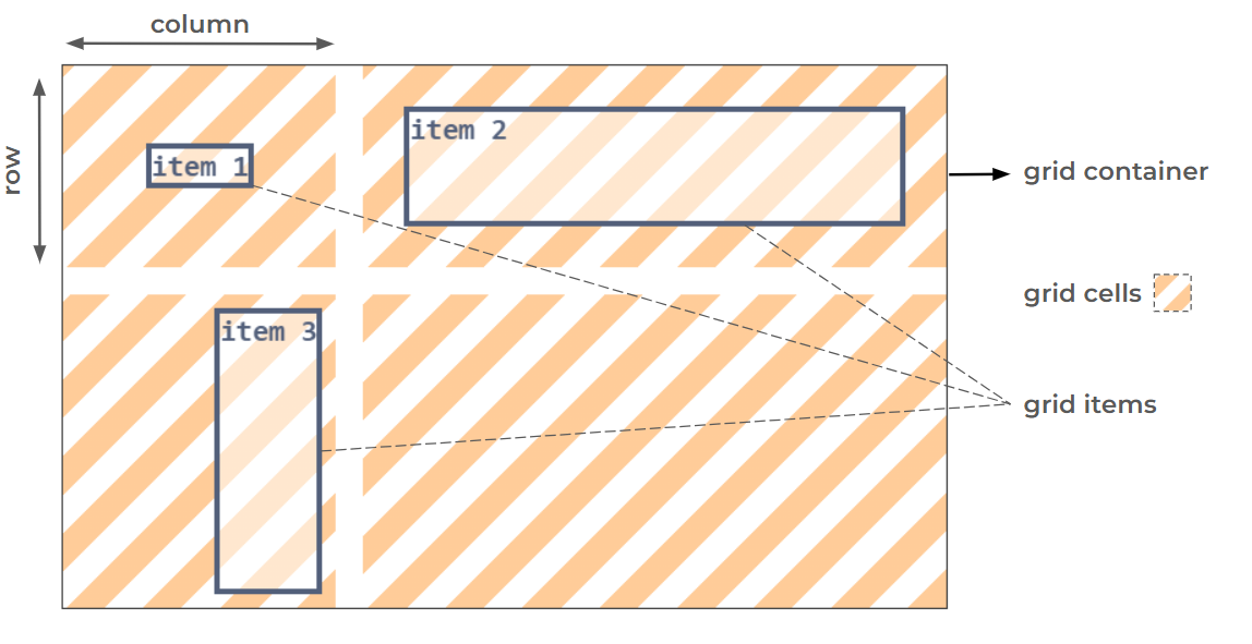
We have the grid container and different rows/columns that intersect to create the grid cells. Then the grid items are placed within the grid cells. The “content” is the grid cells.
If we apply the alignment logic in a grid context, we can say: At the “content level”, we align grid cells inside the grid container and at the “item level”, we align a grid item inside a grid cell. It’s essential to note that at the “content level”, we always align all the elements (grid cells in this case) as a group. We don’t align each grid cell individually.
Ready to align? #
The trickiest part is that we don’t see the grid cells, so it‘s hard to visualize the “content level” alignment. For the sake of simplicity, you will be able to toggle the visibility of the grid cells in all the demos.
Let’s jump straight into the first one.
/* Update the values */
.grid {
display: grid;
justify-content: ;
align-content: ;
grid-template-columns: 160px;
grid-template-rows: 160px;
}
.grid .item { /* Fixed size */
justify-self: ;
align-self: ;
}We have one column and one row with fixed sizes, hence one grid cell. By adjusting the *-content properties, you align the grid cell within the grid container, and by adjusting the *-self properties, you align the grid item within the grid cell. Easy, right?
What are the values “start” and “end”? Why don’t we have the classic “left/right" and "top/bottom”?
"left/right" and "top/bottom" are physical values, while "start" and "end" are logical values. The logical values will be mapped to the physical values depending on the configuration (the axis, the writing mode, etc). In the previous example, start is equivalent to left when used with justify-* properties and equivalent to top when used with the align-* properties. Same logic with the end value.
In 90% of the cases, the mapping is always the same especially when working with English content (left-to-right). However, keep in mind that it may change if you are dealing with a different language. Here is the same demo with Arabic content (right-to-left) where you will notice that the values are swapped in the horizontal axis.
/* Update the values */
.grid {
display: grid;
justify-content: ;
align-content: ;
grid-template-columns: 160px;
grid-template-rows: 160px;
}
.grid .item { /* Fixed size */
justify-self: ;
align-self: ;
}While some of the physical values are still valid (like left and right), it’s better to familiarize yourself with the logical values.
Let’s add more cells with different sizes.
/* Update the values */
.grid {
display: grid;
justify-content: ;
align-content: ;
justify-items: ;
align-items: ;
grid-template-columns: 130px 150px;
grid-template-rows: 120px 160px;
}
.grid .item1 { /* Fixed size */
justify-self: ;
align-self: ;
}
.grid .item2 { /* Fixed size */
justify-self: ;
align-self: ;
}
.grid .item3 { /* Fixed size */
justify-self: ;
align-self: ;
}In this example, you can see the effect of the values space-between, space-around, and space-evenly. You can also align all the items using the *-items properties. It’s important to understand the relation between “self” and “items”. The latter defines one alignment for all items, which you can override later for specific items using *-self. The auto value is the default value of the *-self properties, and it means: “use the value set on the *-items properties”.
Don’t be shy with the demos! Try as many combinations as possible to understand the effect of each property. You can also click the shuffle button and get a random configuration to study.
Auto Sizing #
Now, let’s take the previous example and remove all the fixed sizes.
/* Update the values */
.grid {
display: grid;
justify-content: ;
align-content: ;
justify-items: ;
align-items: ;
grid-template-columns: auto auto;
grid-template-rows: auto auto;
}
.grid .item1 { /* Auto size */
justify-self: ;
align-self: ;
}
.grid .item2 { /* Auto size */
justify-self: ;
align-self: ;
}
.grid .item3 { /* Auto size */
justify-self: ;
align-self: ;
}The grid cells and the grid items fill all the available space, and when you adjust the alignment, they will suddenly shrink to fit the content inside them.
What’s the “normal” value?
It’s the default value of the *-content and *-items properties (it was not start) and, in the context of a grid layout, it’s equal to “stretch”. As its name suggests, it will stretch the elements to fill all the available space.
Why don’t we have a “stretch” value?
The stretch value exists, and you can use it, but the normal value is a special one. In addition to being the default value, it has a different behavior based on the layout. In other words, we don’t have the same defaults for each layout, and the normal value will reflect this. We can also conclude that we always have redundant values since normal behaves the same as another value.
Here is another example with auto sizing and fixed sizing, where the list of all the alignment values is complete. Try different combinations and see how things behave.
/* Update the values */
.grid {
display: grid;
justify-content: ;
align-content: ;
justify-items: ;
align-items: ;
grid-template-columns: auto 200px;
grid-template-rows: auto 100px;
}
.grid .item1 { /* Fixed size */
justify-self: ;
align-self: ;
}
.grid .item2 { /* Auto size */
justify-self: ;
align-self: ;
}
.grid .item3 { /* Auto size */
justify-self: ;
align-self: ;
}Notice how the alignment affects the dimensions of the auto-sized elements, while the fixed-size elements will only move based on the alignment configuration.
When the auto-sized grid cells get aligned, they will shrink to fit the content inside them. This observation is crucial because it explains many of the failures you can face when trying to align grid items. There is no space inside the grid cell because the grid cell size is the same as the grid item inside it due to “content level” alignment. And since grid cells are not visible, it’s not easy to identify the issue.
auto vs 1fr #
Now let’s replace auto by 1fr
/* Update the values */
.grid {
display: grid;
justify-content: ;
align-content: ;
justify-items: ;
align-items: ;
grid-template-columns: 1fr 200px;
grid-template-rows: 1fr 100px;
}
.grid .item1 { /* Fixed size */
justify-self: ;
align-self: ;
}
.grid .item2 { /* Auto size */
justify-self: ;
align-self: ;
}
.grid .item3 { /* Auto size */
justify-self: ;
align-self: ;
}At first glance, it appears that we have the same output, but if you attempt to align the grid cells, nothing happens. Unlike auto, 1fr will size the grid cells in a way to fill all the available space.
1fr looks the same as stretch, why is the alignment not working?
It’s similar to stretch, but with the sizing and not the alignment.
- When we define fixed sizes, the browser considers them, and any free space will remain unused. Then the alignment comes into play to place the grid cells.
- When we define auto sizes, the browser leaves the job to the alignment. If no alignment is specified, the grid cells are stretched to fill all the available space. If an alignment is specified, the grid cells shrink to fit their content and are placed accordingly.
- When we define
frsizes, the browser uses any available space to size the grid cells (the space is included in the size), leaving no free space, thus no room for alignment. Aligning the grid cells has no effect.
It’s important to remember that sizing is closely related to alignment. We can only align if we have free space (the total size of the items is smaller than the container size). For this reason, the use of fr can be problematic for “content level” alignment because it will always consume the free space, leaving us with nothing to align.
Grid Item Placement #
Having one grid item inside a grid cell (like all the previous examples) is easy, but what about the case where a grid item spans multiple grid cells? How is the grid item aligned?
First, let’s introduce the concept of the grid area. It’s the area where the grid item lives (it’s not really alive, but you get the idea). I said that a grid item is aligned within a grid cell, but in reality, the alignment happens inside the grid area. In the previous examples, the grid area is defined by one grid cell. However, if a grid item spans multiple columns or rows, its grid area will be the combination of multiple grid cells.
The logic of alignment remains the same, with an extra step: identify the area where the grid item is aligned.
/* Update the values */
.grid {
display: grid;
justify-content: ;
align-content: ;
justify-items: ;
align-items: ;
grid-template-columns: 120px 150px 100px;
grid-template-rows: 100px 100px 80px;
}
.grid .item1 { /* Auto size */
justify-self: ;
align-self: ;
}
.grid .item2 { /* Auto size */
justify-self: ;
align-self: ;
}
.grid .item3 { /* Auto size */
justify-self: ;
align-self: ;
}"Item 1" spans 2 columns and 2 rows (4 grid cells), "Item 2" spans 2 rows and 1 column (2 grid cells), and "Item 3" spans 2 columns and 1 row (2 grid cells).
Keep the stretch alignment of the grid items and adjust the alignment of the grid cells to visualize the grid area for each item. It’s the smallest rectangle that contains all the grid cells that a grid item should span.
- At the “content level”, we align the grid cells within the grid container.
- At the “item level”, we align a grid item within its grid area.
- A grid area consists of one or more adjacent grid cells.
normalis the default value of the*-contentand*-itemsproperties. It behaves the same asstretch(It has no effect if we define fixed sizes).autois the default value of the*-selfproperties. It means use the value set on the*-itemsproperties.- The use of
frwill consume all the free space, disabling any “content level” alignment in the corresponding axis.
Flex(box) Container #
Ready for the flexbox layout? You should because it’s harder than the grid layout!
The first step is to identify the “content”, right?
Yes, but in some cases, we don’t have a “content” to align. In the first section, I mentioned two levels of alignment (content and item), but depending on the layout and the axis, one of the levels may not exist. Grid layout is easier to understand because both levels always exist. It’s not the case with flexbox, which can lead to a lot of confusion, but we are here to clear things up.
Flexbox Anatomy #
Let’s first take a look at the anatomy of a flexbox layout.
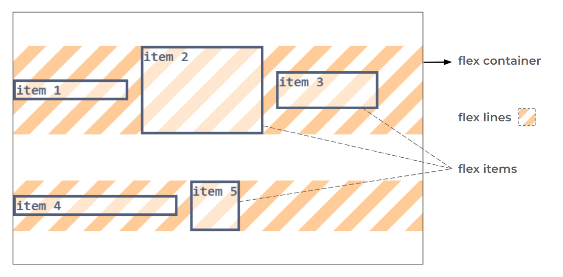
Inside a flex container, we have flex lines. The number of lines depends on the wrapping of the items. We have as many lines as needed to contain all the flex items. While the word flexbox (aka flexible box) is often used, the correct terminology for the container is flex container. Flexbox refers to the entire concept/layout, but "flex container" is the name given to the container with display: flex.
So the flex lines are the content, like with the grid cells?
Yes and no! If we consider the vertical axis, the “content” is the flex lines, and we have both levels of alignment. On the horizontal axis, it’s a different story: We only have “content level” alignment (and it’s not to align the flex lines), but we don’t have “item level” alignment.
Don’t panic! Let’s take a closer look at the layout. Vertically, each item is alone on its flex line, allowing it to be aligned independently within that line, hence the existence of the “item level” alignment. As for the flex lines, they can be aligned vertically as a group (the "content level" alignment).
Horizontally, all the flex items are laid next to each other within the same flex line, so they are no longer independent. Using, for example, justify-self: left on a flex item doesn't make a lot of sense (left of what?), and if we cannot align items individually, we have no “item level” alignment. justify-self and justify-items are ignored inside a flex container.
All that remains is the “content level” alignment, but it’s not to align the flex lines. Horizontally, the flex lines always take all the available space, so we have nothing to align. The “content” in the horizontal axis is the flex items so justify-content will align the flex items.
But you said we cannot align the flex items?! I am lost.
We cannot align them individually, but we can align them as a group. justify-items: left means that “each” item needs to be aligned on the left, but that’s not possible because we cannot define a “left” for each item. But justify-content: left aligns the whole content at the left, so all the items are stacked on the left.
At the “content level” alignment, we align all the elements as a group. Remember what we did in the grid layout. Did we align grid cells individually? Never; we always align them as a group. For this reason, we have values such as space-between, space-evenly, and space-around. Those values are not valid with “item level” alignment because we align items individually.
Ready to align? #
Enough talking, let’s jump into the first demo to understand better. Similar to the grid demos, you can toggle the visibility of the flex lines.
/* Update the values */
.flex {
display: flex;
flex-wrap: wrap;
justify-content: ;
align-content: ;
align-items: ;
}
.flex .item1 {
align-self: ;
}
.flex .item2 { /* Fixed height */
align-self: ;
}
.flex .item3 {
align-self: ;
}
.flex .item4 {
align-self: ;
}
.flex .item5 {
align-self: ;
}Did you notice it? We have a similar stretch behavior to the grid layout. The flex items and the flex lines fill all the vertical space by default. It means that the normal value (the default one) is the same as the stretch value. The only difference is that we cannot define the height of flex lines (unlike with grid cells), so they will always stretch unless you change the alignment. As for the flex items, you can define an explicit height (like with item 2), and you won’t have a stretch effect.
Why don’t the flex items stretch horizontally as well?
Good observation! Logically, they should stretch, but default behaviors are different from one layout to another. The stretch value is still a valid value of justify-content, but it’s the same as start. The normal value will also behaves as start which gives us three different values that do the same thing. Another reason why alignment can be confusing if you don’t understand it correctly.
The reason behind this choice is that we have the flex-grow property that controls the free space, so if you want a stretch behavior, add flex-grow: 1 to all the flex items. Similar to the fr sizing, the use of flex-grow with at least one flex item will disable the content alignment in the corresponding line because it will consume all the available space. Always remember that sizing and alignment are closely related.
/* Update the values */
.flex {
display: flex;
flex-wrap: wrap;
justify-content: ;
align-content: ;
align-items: ;
}
.flex .item1 {
flex-grow: 1;
align-self: ;
}
.flex .item2 { /* Fixed height */
align-self: ;
}
.flex .item3 {
align-self: ;
}
.flex .item4 {
align-self: ;
}
.flex .item5 {
align-self: ;
}In the first line, item 1 is consuming all free space, so justify-content will have no effect. Only the items on the second line are aligned.
To Wrap or not to Wrap #
In the previous examples, I activated the wrapping by adding flex-wrap: wrap, but let’s not forget that the default value is nowrap, which means all items are forced to stay on the same line even if they would overflow.
What does the wrapping have to do with alignment?
With a nowrap configuration, we no longer have “content level” alignment vertically. We have only one flex line that always fills all the vertical space (Nothing to align). Now, you know why align-content never works with flexbox!
Ready for more flexbox mysteries? If we activate the wrapping, but the items don't wrap (there is enough space for them to stay next to each other), do we have “content level” alignment or not?
We have one flex line, so logically no.
False! We have one flex line, but we can align it using align-content. Whatever the number of flex lines, if you use flex-wrap: wrap, the “content level” alignment is activated vertically. In the demo below, you can update the flex-wrap property and see its impact on align-content.
/* Update the values */
.flex {
display: flex;
flex-wrap: ;
justify-content: ;
align-content: ;
align-items: ;
}
.flex .item1 {
align-self: ;
}
.flex .item2 { /* Fixed height */
align-self: ;
}
.flex .item3 {
align-self: ;
}By understanding this mechanism, you unlock a secret way to center an element inside a flex container.
.center {
  display: flex;
  flex-wrap: wrap;
  place-content: center;
}
place-content alone centers horizontally because only justify-content is considered. align-content is ignored until you activate the wrapping.
Row or Column? #
It’s time to talk about flex-direction. As you know, we can either have a row direction (the default configuration) or a column direction. When we change to a column direction, everything is flipped.
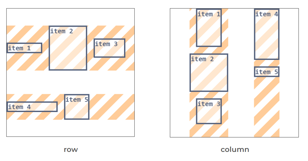
The items are placed from top to bottom, and the flex lines behave like columns. The logic of alignment remains the same, but the axes are switched. For this reason, we typically refer to the main and cross axes in a flexbox layout. When the direction is row, the main axis is the horizontal one and the cross axis the vertical one. When the direction is column, the main axis is the vertical one, and the cross axis is the horizontal one.
The justify-content property works on the main axis, and the align-* properties work on the cross axis.
So the same property can align horizontally and vertically?!
Exactly! For example, justify-content is used to align the flex items horizontally, but if you change the direction to column, it will align them vertically!
/* Update the values */
.flex {
display: flex;
flex-wrap: wrap;
flex-direction: column;
justify-content: ;
align-content: ;
align-items: ;
}
.flex .item1 {
align-self: ;
}
.flex .item2 { /* Fixed width */
align-self: ;
}
.flex .item3 {
align-self: ;
}
.flex .item4 {
align-self: ;
}
.flex .item5 {
align-self: ;
}Do you see why flexbox is harder than grid? Three values of justify-content behave the same, justify-items is ignored, align-content doesn’t work unless you activate the wrapping, we cannot control the height of the flex lines, and flex-direction will flip the whole layout.
- We have the main and cross axes:
- row direction: main = horizonal and cross = vertical.
- column direction: main = vertical and cross = horizontal.
- In the main axis, we only have “content level” alignment, where we align the flex items.
- There is no stretch alignment in the main axis (
normalandstretchbehave asstart). - In the cross axis:
- At the “content level”, we align the flex lines within the flex container.
- At the “item level”, we align a flex item within its flex line,.
flex-wrap: nowrapdisables the “content level” alignment in the cross axis.
Block Container #
When discussing layout, we often refer to flexbox and grid, and we forget the default layout that involves block and inline elements. Similar to a grid container and a flex container, a block container follows the same alignment logic.
Again? Content, items, level of alignment, and all the stuff?!
Yes, but don’t worry, it’s going to be easy because on each axis we have only one level of alignment. On the vertical axis, we have “content level” alignment, and on the horizontal axis, we have “item level” alignment.
Block Anatomy #
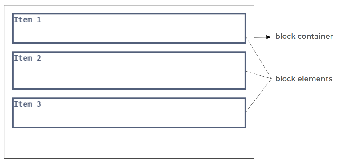
Inside a block container, block elements are placed on top of each other. As simple as that! Don’t forget that the html and body are the first block containers you have in your code.
Ready to align? #
Horizontally, the block elements are placed on top of each other. It means we can align them individually on the horizontal axis, so we have “item level” alignment, and we can use justify-items and justify-self. We don’t have “content level” alignment on the horizontal axis, so justify-content is ignored.
Vertically, we cannot align each item individually since they are placed together on that axis. We don’t have “item level” alignment so align-items and align-self are ignored. It’s the same logic we had with flexbox, where the flex items are placed together on the same flex line.
What remains is “content level” alignment on the vertical axis, and for that, we need to identify the “content”. It’s the smallest rectangle that can contain all the items inside the container. In other words, it’s a rectangle that has the same width as the container (since we don’t have “content level” alignment horizontally) and the items inside it define its height.
But you are describing the container. What’s the difference between the container and the content?
In 90% of the cases, we can say that the content is the same as its container since the latter, by default, has its height defined by the items inside it, BUT once we explicitly define a height for the container, we can see a difference. Don’t forget that alignment is closely related to the sizing and free space.
The content will always have its height defined by the items, but the container can either have its height defined by the items (the default behavior) or specified differently (by setting the height property or inside a layout where other properties define its height).
Here is a demo where you can adjust the alignment properties as well as the height property.
⚠️ Only Chrome has full support of the alignment properties inside block container ⚠️
/* Update the values */
.block {
display: block;
height: ;
align-content: ;
justify-items: ;
}
.block .item1 {
justify-self: ;
}
.block .item2 { /* Fixed size */
justify-self: ;
}
.block .item3 {
justify-self: ;
}If height: auto is specified align-content will do nothing since the container height will be the same as the “content” (no free space), and we don’t have a stretch behavior, so normal and stretch will behave the same as start.
And since "content" is always one element inside a block container, space-around and space-evenly will behave the same as center! Yes, you can vertically center the content using align-content: space-around or align-content: space-evenly. Worth noting that the same applies to flexbox and grid if we have one flex line or one grid cell in the corresponding axis.
You have unlocked additional ways to center a single element inside a container!
.center {
  display: grid;
  place-content: space-around | space-evenly;
}
.center {
display: flex;
flex-wrap: wrap;
place-content: space-around | space-evenly;
}What about inline elements? #
When dealing with inline elements, we have two situations. The first situation occurs when a block container contains only inline elements (such as images, text, inputs, inline-block elements, etc.). In this case, since there are no block elements inside, we don’t have “item level” alignment horizontally. We only have “content level” alignment vertically.
So we cannot align inline elements horizontally?!
Not with the alignment properties, but using a simple text-align. I don’t want to include this property in the same group as the others, as it’s used to align a particular content: inline content. You don’t always need to use display: flex or display: grid everywhere to align stuff. Sometimes a simple text-align will do the job, especially when dealing with text.
The second situation is when a block container contains a mix of inline and block elements. The browser doesn’t like this and will try to “fix” the layout to make sure there are only block elements inside the block container. To achieve this, the browser creates “anonymous block boxes” to encapsulate the inline elements.
Take the following code:
<body>
  some text
  <section> text inside the setion</section>
  more text
</body>
Within body, we have a block element (section) with inline content (text). The browser will do the following:
<body>
  <anonymous_block>some text</anonymous_block>
  <section> text inside the setion</section>
  <anonymous_block>more text</anonymous_block>
</body>
Both texts are now inside block elements, and we are back to a configuration where we have only block elements inside the block container.
Now that the structure is in place, we can align the elements but …
We cannot align the anonymous block boxes, right?
Exactly! Since those blocks don’t really exist, you cannot target them to apply justify-self and justify-items will also ignore them.
It should be noted that the block elements inside the block container are also block containers for their content (unless you update their display value), so in the end, it’s an imbrication of block containers until we reach block containers that contain only inline elements.
Here is a code with different levels of block containers, where there is one anonymous block box (can you figure out where it is?)
<div class="block">
 <div class="item1">Item 1</div>
 <div class="item2">
  <div class="item2_1">item 2.1</div>
  <div class="item2_2">item 2.2</div>
 </div>
 <div class="item3">
  Item 3
  <div  class="item3_1">item 3.1</div>
 </div>
</div>
And a demo using the above structure. Click shuffle and have fun!
/* Update the values */
.block {
align-content: ;
justify-items: ;
}
.block .item1 {
justify-self: ;
}
.block .item2 { /* Fixed size */
justify-self: ;
align-content: ;
justify-items: ;
}
.block .item2 .item2_1 {
justify-self: ;
}
.block .item2 .item2_2 {
justify-self: ;
}
.block .item3 { /* Fixed height */
justify-self: ;
align-content: ;
justify-items: ;
}- In a block container, we have only one level of alignment per axis: “content level” alignment vertically and “item level” alignment horizontally.
- An item is a block element.
- The content is the smallest rectangle containing all the items.
- There is no stretch behavior for content
- A block container can either contain inline elements or block elements. When both are present, the browser will create “anonymous block boxes” to encapsulate the inline elements.
- We cannot align the “anonymous block boxes”.
- When a block container contains inline elements, there is no “item level” alignment horizontally. You can use
text-alignto align the inline elements horizontally.
auto margins #
margin: auto is a classic, right? You can add it to any element, and you have a 90% chance of centering it, plus it works with all the layouts. It's time to understand what the auto value is doing to avoid the 10% of times where it doesn’t behave like you expect.
Let’s introduce the concept of a margin box. As you know, an element can have padding, border, and margin. The margin box of an element is a box that contains the element plus its margin. We generally consider margin as a space around an element, but that space is still part of the element.
Is this important for alignment?
Yes, because when we align an item, we align its margin box. For example, if you add margin: 10px to an element and align it to the left, then you will have 10px of space between the left edge of the container and the left edge of the element. Seen differently, we have 0 space between the margin box of the element and the container. Understanding that margin is included in the alignment is crucial for understanding how auto margin works.
Here is a demo that allows you to align an element and update its margin. I am using a grid layout, but the same applies to all the layouts.
/* Update the values */
.grid {
display: grid;
justify-content: ;
align-content: ;
}
.grid .item {
height: ;
width: ;
margin: ;
justify-self: ;
align-self: ;
}Now, if you use margin-left: auto, you tell the browser to shrink the element to its content size (no more stretching) and use any free space on the horizontal axis to transform it into a margin. I will repeat it: any free space will be transformed into a margin.
But margin-left: auto will push the element to the right, no?
It will as a side effect. If all the free space is transformed into a margin left, then the element will be pushed to the right. In this case, the margin box will fill all the available space, and we have no room for any further alignment. I refer to “item level” alignment since we can apply margin to only items and not to the content (we cannot have margin for grid cells, flex lines, etc).
The logic is as follows when we process “item level” alignment:
- If we have no fixed size and no auto margin, the item is stretched to fill all the available space unless an alignment different from stretch is defined.
- If we have a fixed size and no auto margin, we have unused free space (no stretch behavior), and the alignment will place the element accordingly.
- If we have no fixed size and auto margin, the item shrinks to fit its content, and any free space will be used as margin: no stretch behavior and no room for alignment.
- If we have a fixed size and auto margin, any free space will be used as margin: no stretch behavior and no room for alignment.
It appears that we are aligning using auto margin (which is visually evident) but in reality we are increasing the margin box of an element by transforming the free space into a margin.
So what is the difference between margin: auto and place-self: center?
In most cases, you will see no visual difference. Both will center the element, but with margin: auto, the margin box of the element will fill all the available space, while in the second case, the margin box is equal to the element size and we have free space around the element.
A few more notes:
- auto margin works on the main axis in flexbox, even if we don’t have “item level” alignment. If flex-grow is used, it will consume the free space before the auto margin.
- When auto margin is used on both sides (top and bottom or left and right), the free space will be equally split between both sides. That’s what centers an item.
- With block elements, auto margin doesn’t work vertically (the only case where auto margin doesn’t work). Horizontally, you generally need to define a width (or max-width) to see the effect of auto margin.
Absolutely-positioned elements #
Elements with position: absolute (or fixed) are a bit special, but the logic of alignment still applies to them. In this situation, we have a “lonely” out-of-flow element that needs to be aligned within a specific area. We only have “item level” alignment, and since it’s one item, only the *-self properties are concerned.
First, let’s introduce the concept of containing block. In this context, it refers to the padding box of the nearest ancestor with a position value other than static. That moment when you need to set position: relative to the parent element; the padding area of that element is the containing block.
Now let’s talk about the inset-modified containing block (I will refer to it as IMCB). When you define the values for the top/left/right/bottom properties (or the inset shorthand property), you are defining the area of the IMCB. For example, if you use inset: 0, the IMCB area is the same as the containing block. If you set inset: 10px, you reduce the area from each side by 10px.
That IMCB is the area where we align the element using *-self properties. Here is a demo where you can adjust the top/left/right/bottom as well as the alignment values.
/* Update the values */
.container {
position: relative;
}
.container .item {
position: absolute;
top: ;
bottom: ;
left: ;
right: ;
justify-self: ;
align-self: ;
}Notice how the element is stretched within the IMCB until you update the alignment, which means the normal value is equivalent to stretch as well.
What about elements with position: fixed?
They follow the same logic but have a different containing block. It’s the viewport, not the nearest ancestor with a position value other than static.
And what about centering using left: 50%; top:50%; translate: -50% -50%
That’s what most of the online resources will recommend, but I consider it as the old way. It’s still valid and you can use it, but keep in mind that the use *-self properties makes more sense as it’s more intuitive. After all, inset: 0; place-self: center is much clearer.
Can we use margin: auto to align as well?
Yes, but you are required to define a size. Unlike with flexbox or grid, auto margin will not shrink the element, so if no size is specified, we don’t have free space to transform into margin. It’s similar to block elements where we need an explicit width (or max-width) to see the effect of auto margin.
Centering with margin will looks like below:
.center {
  position: absolute;
  inset: 0;
  width: fit-content;
  height: fit-content;
  margin: auto;
}
It’s valid as well, but a bit more verbose compared to
.center {
  position: absolute;
  inset: 0;
  place-self: center;
}
Worth noting that the use of the *-self properties with absolutely-positioned elements is quite new, and some old browsers don’t support it. You may still need to use the translate or the auto margin method for a while until better support.
Safe alignment #
Ready for one last thing? I promise it’s the last and easiest one!
I told you that alignment is always related to sizing and free space. We can only align if we have free space; otherwise, nothing will happen. In some cases, the free space can be negative, meaning the total size of the items exceeds the container size.
The items will overflow, right?
Yes, but we can still align them when they overflow. Here is a demo where you can update the width of the container and see how the items are aligned.
/* Update the width */
.container {
width: ;
white-space: nowrap; /* to force the overflow */
}
.grid .item1 {
justify-self: center;
}
.grid .item2 {
justify-self: end;
}The first one is centered (it overflows from both sides), and the second one is aligned to the end (it overflows from the left side). Until now, it’s ok but things start to get messy when we add a scrollbar to the container. When the container is small and you try to scroll it, the content on the left is unreachable!
/* Update the width and the overflow */
.container {
width: ;
overflow: ;
white-space: nowrap; /* to force the overflow */
}
.grid .item1 {
justify-self: center;
}
.grid .item2 {
justify-self: end;
}I won’t bother you with the “why” it behaves like that, but you can fix this by using safe alignment. For example, instead of using justify-self: center, you can use justify-self: safe center. The safe value is valid with all the alignment properties.
Why is “safe” not the default behavior?
I cannot tell the exact reason for this choice, but in some cases, you may want the default behavior especially if you don’t have a scrollbar mechanism. Don’t automatically add the safe value everywhere, thinking it’s good to be safe. Use it only when you are unable to scroll the whole content.
In the demo below, you can toggle the safe alignment for the items and see how it behaves when the container size is small. Notice how for both elements the alignment becomes start when we have an overflow.
/* Update the values */
.container {
width: ;
overflow: ;
white-space: nowrap; /* to force the overflow */
}
.grid .item1 {
justify-self: ;
}
.grid .item2 {
justify-self: ;
}It should be noted that aligning with auto margin is always “safe”. You will never encounter such an issue since margin only considers positive free space and will have no effect when we have a negative free space. Here is the same demo where I am using margin instead of the alignment properties.
/* Update the values */
.container {
width: ;
overflow: ;
white-space: nowrap; /* to force the overflow */
}
.grid .item1 {
margin: auto;
}
.grid .item2 {
margin-left: auto;
}Already the end? #
We reached the end of this exploration, and I hope you enjoyed it. Don't be discouraged if some parts were a bit complex. It often takes a couple of readings for new concepts to become clear, so bookmark the link and get back from time to time to refresh your memory.
I attempted to cover the most important concepts of alignment, but I don’t consider this exploration to be 100% complete. I deliberately omitted a few things that you will probably never need. I may also update the content at any time to ensure it remains up to date.
Let’s end with a small quiz and see how much you retained from this exploration.
Quiz #
In a flexbox layout, justify-content can be used to align flex items:
Which of the following is not a valid property:
space-between can be used with:
A grid item is aligned within a:
In a grid layout, place-content will align:
In a flexbox layout, align-content will align:
When we align an item, we align its:
In a flexbox layout, what property can disable content alignment vertically:
The safe value can be used with:
Which of the following is a valid value: