The unknown behavior of flex-wrap
flex-wrap: wrap allows items to wrap onto multiple lines but it has another function. It transforms your flex container from a single-line to a multi-line container even if at the end you have only one flex line. This means we can use align-content to align the content.
In other words, you need to use flex-wrap: wrap to align the content using align-content even if there is no wrapping.
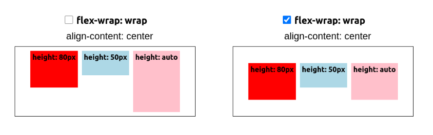
It's different from align-items which aligns the items inside the line whereas align-content aligns the whole line. Here is an interactive demo to see the behavior of each property:
See the Pen flex-wrap & alignment by Temani Afif (@t_afif) on CodePen.
More CSS Tips
- Arrow-like Box with rounded corners Create a rectangle with a rounded triangle shape on one side.
- Polygon shapes with rounded corners Use modern CSS and Sass to generate the code of rounded polygon shapes.
- Zig-Zag edges using CSS mask One line of code to add Zig-Zag edges to any element using the mask property.
- Split and assemble an image using CSS mask A few lines of code to create a fancy reveal animation for images.