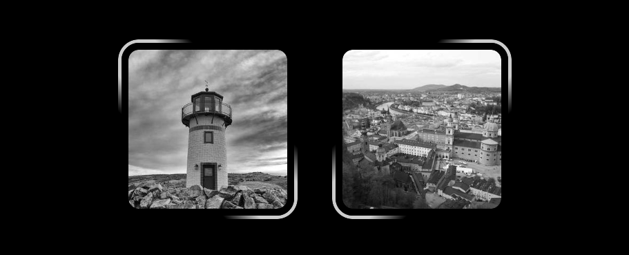
Glowing border animation with a smooth stop
Add a glowing border animation around your image (or any element) with a few lines of code. The cool part? It's an infinite animation on hover that stops smoothly when the mouse leaves the element!
Single element implementation powered by modern CSS (@property, CSS Mask, Math functions, etc).

@property --a {
  syntax: "<angle>";
  inherits: false;
  initial-value: 0deg;
}
@property --i {
  syntax: "<number>";
  inherits: false;
  initial-value: 0;
}
img {
  border: 5px solid #ccc;
  padding: 10px; /* control the gap */
  mask:
    conic-gradient(#000 0 0) content-box,
    linear-gradient(calc(mod(var(--a),180deg)*var(--i) + 45deg),
      #0000 30%,#000 40% 60%,#0000 70%) subtract,
    conic-gradient(#000 0 0) padding-box;
  transition: --i .5s,--a 0s .5s;
}
img:hover {
  --i: 1;
  --a: 15turn;
  transition: --i 0s,--a 30s linear;
}
See the Pen Glowing border animation on hover with a smooth stop by Temani Afif (@t_afif) on CodePen.
Another version where the border will choose the shortest path when returning to the initial position. Hover a lot of times to notice the difference!
See the Pen Glowing border animation on hover with a smooth stop II by Temani Afif (@t_afif) on CodePen.
More CSS Tips
- Overflow/scrollbar detection using modern CSS Using scroll-driven animations you can detect when an element is overflowing or has a scrollbar.
- A new way to center block elements using place-self A modern way to center block elements using place-self instead of auto margin and max-width.
- How to correctly use steps() with animations The default behavior of steps() is not intuitive so learn how to use it correctly.
- Vertical rounded tabs using CSS mask A few lines of code to get vertical rounded tabs using CSS mask.