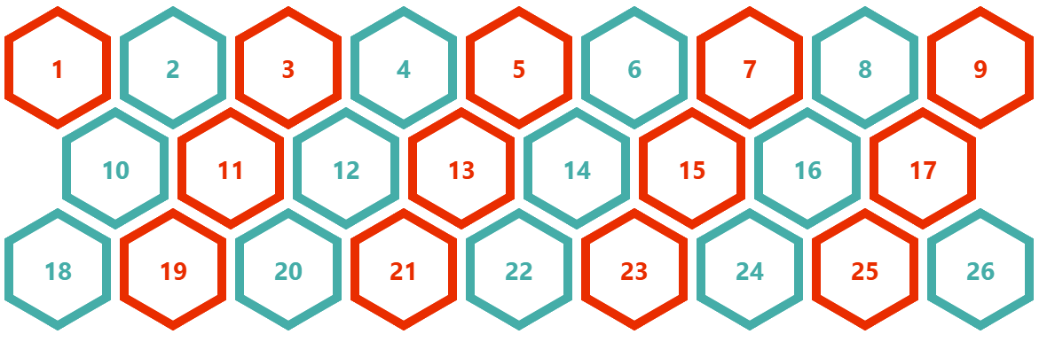
Responsive Hexagon Grid without Media Queries
Using modern CSS to improve an old implementation of a responsive hexagon grid. coner-shape to create the hexagon shape and sibling-index() combined with math functions to conditionally apply a margin to only the first element of every other row.
.container {
  --s: 120px;  /* size  */
  --g: 10px;   /* gap */

  display: flex;
  gap: var(--g);
  flex-wrap: wrap;
  container-type: inline-size; /* to be able to query the container width (100cqw) */
}
.container > * {
  width: var(--s);
  /* Create the hexagon shape */
  aspect-ratio: cos(30deg);
  border-radius: 50% / 25%;
  corner-shape: bevel;
  /**/
  margin-bottom: calc(var(--s)/(-4*cos(30deg))); /* Create an overlap between the rows */
  /* Some calculation to add a margin-left to the first element of every other row */
  --_n: round(down,(100cqw + var(--g))/(var(--s) + var(--g)));
  --_m: round(down,(100cqw - (var(--s) - var(--g))/2)/(var(--s) + var(--g)));
  --_c: round(down,1 - mod((sibling-index() - 1 + var(--_m))/(var(--_n) + var(--_m)),1));
  margin-left: calc(var(--_c)*(var(--s) + var(--g))/2);
}
Chrome-only for now. Consider my previous implementation for better support.
See the Pen Responsive Grid of hexagon without media queries by Temani Afif (@t_afif) on CodePen.
Here is the other version of the hexagon:
See the Pen Responsive Grid of hexagon without media queries by Temani Afif (@t_afif) on CodePen.
We can extend the code to consider more shapes, such as a rhombus and an octagon
.container {
  --s: 100px;  /* size  */
  --g: 10px;   /* gap */

  display: flex;
  gap: var(--g);
  flex-wrap: wrap;
  container-type: inline-size;
}
.container > * {
  width: var(--s);
  corner-shape: bevel;
  --_n: round(down,(100cqw + var(--g))/(var(--s) + var(--g)));
  --_m: round(down,(100cqw - (var(--s) - var(--g))/2)/(var(--s) + var(--g)));
  --_c: round(down,1 - mod((sibling-index() - 1 + var(--_m))/(var(--_n) + var(--_m)),1));
  margin-left: calc(var(--_c)*(var(--s) + var(--g))/2);
}
.rhombus > *  {
  aspect-ratio: 1;
  border-radius: 50%;
  margin-bottom: calc(var(--s)/-2);
}
.octagon {
  --g: calc(10px + var(--s)/(sqrt(2) + 1));
  gap: 10px var(--g);
}
.octagon > * {
  aspect-ratio: 1;
  border-radius: calc(100%/(2 + sqrt(2)));
  margin-bottom: calc(var(--s)/(-1*(2 + sqrt(2))));
}
See the Pen Responsive Grid of various shapes by Temani Afif (@t_afif) on CodePen.
More CSS Tips
- Recreating the <filedset> component and its <legend> Using basic HTML and a few lines of CSS to recreate the fieldset component.
- A Generator for Random Wavy Dividers Easily get the code of a fancy wavy divider using the shape() function.
- Fizz Buzz using Modern CSS (no HTML) A fun experiment using modern CSS to create the classic Fizz Buzz.
- The Hidden Selectors of The HTML Element Discover alternative selectors for the html element beyond the classic :root{} and html{}.