Responsive Infinite Logo Marquee
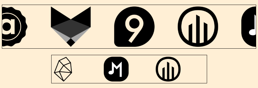
With the powerful shape() function and the new sibling-index()/sibling-count() functions, we can create an infinite logo marquee using a few lines of code.
- Responsive (It doesn't depend on the container width)
- Works with any number of images
- Easy to control using CSS variables
- No magic numbers
<div class="container">
  <img src="">
  <img src="">
  <!-- as many images as you want -->
</div>
.container {
--s: 150px; /* size of the logos */
--d: 8s; /* animation duration */
--n: 4; /* number of visible logos */
display: flex;
overflow: hidden;
}
img {
width: var(--s);
offset: shape(from calc(var(--s)/-2) 50%,hline by calc(sibling-count()*max(100%/var(--n),var(--s))));
animation: x var(--d) linear infinite calc(-1*sibling-index()*var(--d)/sibling-count());
}
@keyframes x {
to {offset-distance: 100%}
}⚠️ Limited support (Chrome only for now) ⚠️
See the Pen Responsive infinite logo marquee by Temani Afif (@t_afif) on CodePen.
The technique is not limited to image elements. It works with any kind of content.
The only requirement is to have equal-width items:
See the Pen Infinite scroll animation by Temani Afif (@t_afif) on CodePen.
See the Pen Responsive Infinite marquee animation by Temani Afif (@t_afif) on CodePen.
Related: Infinite Marquee Animation using Modern CSS
More CSS Tips
- Circular Gallery of Rounded Images A fancy gallery of images created with few lines code.
- Dynamic media/container queries using if() Use modern CSS to express media queries and container queries differently.
- Dynamic nth-child() using sibling-index() and if() Use modern CSS to control the arguments of nth-child() and update them on the fly.
- Get the index of an element within its parent A native CSS function to get the index of an element among its siblings within a parent element.