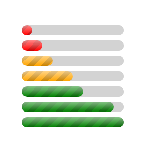
Progress bar with dynamic coloration
Create a CSS-only progress bar with a dynamic coloration. The color change based on the value
- No JavaScript
- No specific CSS selector
progress[value] {
  --w: 200px; /* The width */
  /* The background property */
  --b: /* static layers */
      linear-gradient(#fff8,#fff0),
      repeating-linear-gradient(135deg,#0003 0 10px,#0000 0 20px),
      /* dynamic layers */
      /* if < 30% "red" */
      conic-gradient(red    0 0) 0 /calc(var(--w)*.3 - 100%) 1%,
      /* if < 60% "orange" */
      conic-gradient(orange 0 0) 0 /calc(var(--w)*.6 - 100%) 1%,
      /* else "green" */
      green;
  width: var(--w);
}
progress[value]::-webkit-progress-value {
  background: var(--b);
}
progress[value]::-moz-progress-bar {
  background: var(--b);
}
See the Pen Progress bar with dynamic colors by Temani Afif (@t_afif) on CodePen.
More CSS Tips
- Multi-line text decoration Use CSS gradients to decorate your text.
- Circular dashed border Use mask and gradient to create a fancy dashed border.
- CSS-only plus/cross icon Use one element and one gradient to create a plus/cross icon.
- Corner-only border around an image Use CSS gradient and mask to create a Corner-only border around your image.