Puzzle shapes using CSS mask
Create different kind of puzzle shapes using a few lines of code
- Single element (Works with
<img>) - Optimized with CSS variables
- Powered by CSS mask
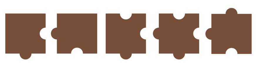
.puzzle {
  --r: 30px;  /* control the circle radius */
  --s: 200px; /* control the main size */

  width: var(--s);
  height: calc(var(--s) + var(--r));
  mask:
    radial-gradient(var(--r) at 50% calc(100% - var(--r)),#000 calc(100% - 1px),#0000),
    radial-gradient(var(--r) at right,#0000 calc(100% - 1px),#000)
     0 0/100% calc(100% - var(--r)) no-repeat;
}
Find more variations here: css-shape.com/puzzle
A demo using the different shapes to create a grid of images
See the Pen Untitled by Temani Afif (@t_afif) on CodePen.
More CSS Tips
- How to correctly define a one-color gradient The most optimized way to create a one-color gradient.
- Avatar hover effect with a rhombus shape Add a fancy hover effect to your image with a simple code.
- Default behavior of position absolute Know the meaning of initial containing block and its relation with position absolute.
- Animate to height/width auto (without hacks) A new CSS feature to easily animate to height/width auto with no complex code.