Responsive Pyramidal Grid of Hexagon Shapes (and more!)
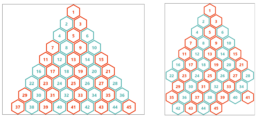
Following the previous post, here is another type of responsive grid: a pyramidal grid of hexagon shapes! Another fancy layout powered by modern CSS, math functions, and without media queries.
.container {
  --s: 40px;  /* size  */
  --g: 5px;   /* gap */

  display: grid;
  grid-template-columns: repeat(auto-fit, var(--s) var(--s));
  justify-content: center;
  gap: var(--g);
  container-type: inline-size;
}
.container > * {
  grid-column-end: span 2;
  aspect-ratio: cos(30deg);
  border-radius: 50% / 25%;
  corner-shape: bevel;
  margin-bottom: calc((2*var(--s) + var(--g))/(-4*cos(30deg)));
  --_n: round(down,(100cqw + var(--g))/(2*(var(--s) + var(--g))));
  --_i: calc((sibling-index() - 2 + (var(--_n)*(3 - var(--_n)))/2)/(2*var(--_n) - 1));
  --_c: mod(var(--_i),1);
  --_j: calc(sqrt(2*sibling-index() - 1.75) - .5);
  --_d: mod(var(--_j),1);
  grid-column-start:
    if(
      style((--_i >= 1) and (--_c: 0)): 2;
      style(--_d: 0): max(0,var(--_n) - var(--_j));
    );
}
Chrome-only for now.
See the Pen Responsive pyramid of hexagon shapes by Temani Afif (@t_afif) on CodePen.
We can get more variation by adjusting the code slightly.
Rhombus grid:
See the Pen Responsive Pyramid of Rhombus Shapes by Temani Afif (@t_afif) on CodePen.
Octagon grid:
See the Pen Responsive Pyramid of Octagon Shapes by Temani Afif (@t_afif) on CodePen.
Another hexagon grid:
See the Pen Responsive Pyramid of Hexagon Shapes by Temani Afif (@t_afif) on CodePen.
And circles as well:
See the Pen Responsive Pyramid of Circles by Temani Afif (@t_afif) on CodePen.
More CSS Tips
- A Better Way to Express Percentage Height A modern alternative to the classic percentage height that always work.
- How to use the "auto" value with clamp() A CSS trick to use clamp() with sizing values like auto, min-content, max-content, etc.
- A Generator for Random Wavy Dividers Easily get the code of a fancy wavy divider using the shape() function.
- Connecting Circles With Anchor Positioning II Connect circles with arrows and show their distance using modern CSS.