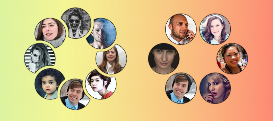
Responsive Circular List of Stacked/Overlapping Images
Building on the idea from the previous post, I created a circular list instead of a horizontal one. The position of the images will adjust according to the container size and available space. You also have a cool hover effect that reveals the images, and the gap between them is transparent!
.container {
  --s: 120px; /* image size */
  --g: 14px;  /* the gap */

  display: grid;
  place-content: center;
  aspect-ratio: 1;
  container-type: inline-size;
}
.container img {
  grid-area: 1/1;
  width: var(--s);
  border-radius: 50%;
  cursor: pointer;
  --_r: min(50cqw - var(--s)/2,(var(--s) + var(--g))/(2*sin(.5turn/sibling-count())));
  --_i: calc(1turn*sibling-index()/sibling-count() + var(--_ii,0deg));
  --_j: calc(1turn*(sibling-index() + 1)/sibling-count() + var(--_jj,0deg));
  --_a: calc(2*asin((var(--s) + var(--g))/(2*var(--_r))) - 1turn/sibling-count());
  transform: rotate(calc(-1*var(--_i))) translate(var(--_r)) rotate(var(--_i));
  mask: radial-gradient(50% 50% at
    calc(50% + var(--_r)*(cos(var(--_j)) - cos(var(--_i))))
    calc(50% + var(--_r)*(sin(var(--_i)) - sin(var(--_j)))),
     #0000 calc(100% - 1px + var(--g)),#000 calc(100% + var(--g)));
  transition: --_i .3s linear,--_j .3s linear;
}
.container.reverse img {
  --_i: calc(1turn*sibling-index()/sibling-count() - var(--_ii,0deg));
  --_j: calc(1turn*(sibling-index() - 1)/sibling-count() - var(--_jj,0deg));
}
.container:has(:hover) img {
  --_ii: var(--_a);
  --_jj: var(--_a);
}
.container img:hover {
  --_ii: 0deg;
    z-index: 1;
}
.container:not(.reverse) img:has(+ :hover),
.container.reverse img:hover + *,
.container:not(.reverse):has(:first-child:hover) img:last-child,
.container.reverse:has(:last-child:hover) img:first-child {
  --_jj: 0deg;
}
Resize the demo below to see how the image behaves. If there is sufficient space, the images will be placed as close as possible without overlap.
See the Pen Responsive Circular List of images with hover effect by Temani Afif (@t_afif) on CodePen.
More CSS Tips
- Direction-Aware CSS Shapes A few lines of code to make any CSS shape adjust according to the direction of the text.
- Direction-Aware Arrow Shape using corner-shape Combining corner-shape and logical properties to create direction-aware shapes..
- The Universal Focus Ring Using anchor positioning to create a fancy focus ring that travels the whole page.
- Dynamic Tooltip Position with Anchor Positioning III Another idea of a tooltip following its anchor.