A reveal hover effect using CSS mask II
Another variation of the previous hover effect with a diagonal reveal. Using the same code structure.
- No extra element (only the
<img>tag) - Less than 10 CSS declarations
- Powered by CSS mask and CSS gradients
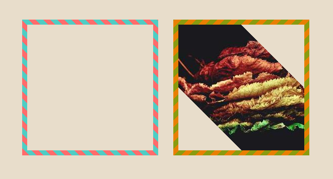
img {
  padding: 10px; /* control the space for the gradient */
  background: repeating-linear-gradient(45deg,#FF6B6B 0 10px,#4ECDC4 0 20px);
  --g: content-box 50% 50%/200% 200% no-repeat;
  mask:
    linear-gradient(#000 0 0),
    linear-gradient(calc(135deg + var(--a,0deg)),#000 50.1%,#0000 0) var(--g),
    linear-gradient(calc(-45deg + var(--a,0deg)),#000 50.1%,#0000 0) var(--g);
  mask-composite: exclude, add;
  transition: .5s;
}
img:hover {
  mask-position: 0% 0%,100% 100%;
}
/* we update the angle for the alternative version */
img.alt {
  --a: 90deg
}
/* and the X movement */
img.alt:hover {
  mask-position: 100% 0%,0% 100%;
}
See the Pen Hover reveal animation using mask II by Temani Afif (@t_afif) on CodePen.
And why not the Zig-Zag version as well
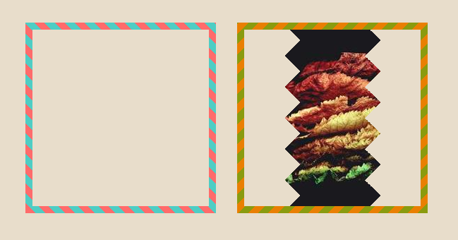
See the Pen Hover reveal animation using mask III by Temani Afif (@t_afif) on CodePen.
More Detail: www.smashingmagazine.com/2023/09/revealing-images-css-mask-animations
More CSS Tips
- A reveal hover effect using CSS mask III Use CSS mask to create a nice reveal effect on hover.
- A simple checkbox using CSS mask A simple checkbox but a nice animation using CSS mask.
- A color wheel with an array of colors A simple conic-gradient() trick to create a color wheel.
- Zoom effect on hover A few lines of code to add for a zoom effect on hover.