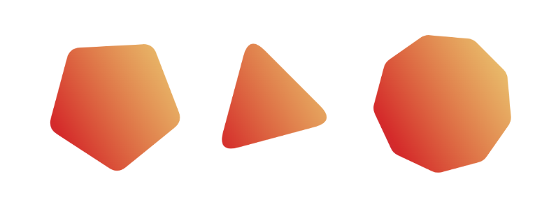
Polygon shapes with rounded corners
Similar to the hexagon shape, here is a generic code to create any regular polygon shape with rounded corners. Powered by Sass and the new shape() function.
$n: 9; /* number of sides*/
$r: .2; /* control the radius [0 1] */
$a: 15deg; /* control the rotation */

$_r: 50%*math.cos(180deg/$n)/math.cos((180deg/$n*(1 - $r)));

.poly {
  aspect-ratio: 1;
  $m: ();
  @for $i from 0 through ($n - 1) {
    $c: line to;@if($i == 0){$c: from;}
    $m: append($m,$c 50% + $_r*math.cos(180deg*(2*$i - $r)/$n + $a)
                     50% + $_r*math.sin(180deg*(2*$i - $r)/$n + $a),comma);
    $m: append($m,curve to 50% + $_r*math.cos(180deg*(2*$i + $r)/$n + $a)
                           50% + $_r*math.sin(180deg*(2*$i + $r)/$n + $a)
      with 50%*(1 + math.cos($i*360deg/$n + $a))
           50%*(1 + math.sin($i*360deg/$n + $a)),comma);
  }
  clip-path: shape(#{$m});
}
See the Pen Polygon shapes with rounded corners by Temani Afif (@t_afif) on CodePen.
Here is another version with CSS variables in case you want to control the radius and rotation on the CSS side:
$n: 7; /* number of sides*/

.poly {
  --r: 0.25; /* control the radius [0 1] */
  --a: 10deg; /* control the rotation */

  aspect-ratio: 1;
  --_a: (#{180deg/$n}*var(--r));
  --_r: (50%*cos(#{180deg/$n})/cos((#{180deg/$n}*(1 - var(--r)))));
  $m: ();
  @for $i from 0 through ($n - 1) {
    $c: line to;@if($i == 0){$c: from;}
    $m: append($m,$c calc(50% + var(--_r)*cos(#{$i*360deg/$n} + var(--a) - var(--_a)))
                     calc(50% + var(--_r)*sin(#{$i*360deg/$n} + var(--a) - var(--_a))),comma);
    $m: append($m,curve to calc(50% + var(--_r)*cos(#{$i*360deg/$n} + var(--a) + var(--_a)))
                           calc(50% + var(--_r)*sin(#{$i*360deg/$n} + var(--a) + var(--_a)))
      with calc(50%*(1 + cos(#{$i*360deg/$n} + var(--a))))
           calc(50%*(1 + sin(#{$i*360deg/$n} + var(--a)))),comma);
  }
  clip-path: shape(#{$m});
}
See the Pen Polygon shapes with rounded corners by Temani Afif (@t_afif) on CodePen.
You can also get the code from my online generator: css-generators.com/polygon-shape
More CSS Tips
- Blob shape with hover effect Add a blob shape to your image with a cool bouncy hover effect.
- A heart shape with modern CSS Use the new shape() function to create a heart shape with minimal code.
- The unknown behavior of flex-wrap flex-wrap doesn't only control the wrapping of items but also affects the alignment.
- Custom progress element using attr() Create a custom progress element with a dynamic coloration based on the value.