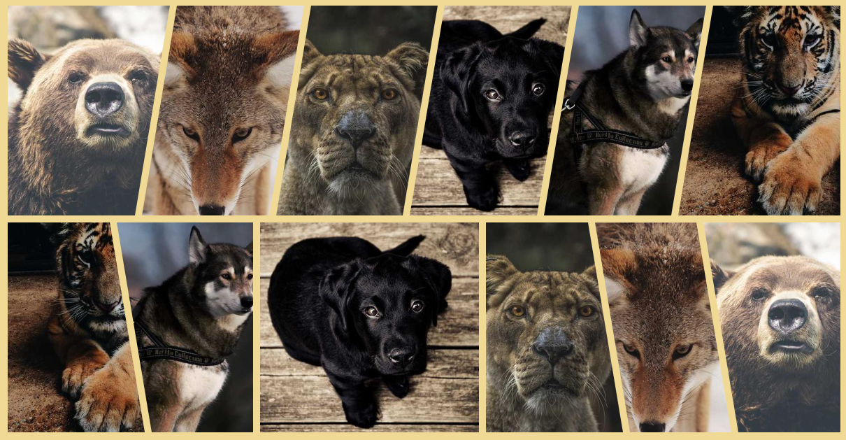
Gallery of Skewed Images with Hover Effect
Another classic component made easy with modern CSS and the new corner-shape. A gallery of skewed images with a reveal effect on hover using a few lines of code. The skewing adjusts accordingly to the direction of the text. Another direction-aware shape!
.gallery {
  --s: 50px; /* control the skewing */

  display: flex;
  gap: 10px;
}
.gallery > img {
  flex: 1;
  border-start-start-radius: var(--s) 100%;
  border-end-end-radius: var(--s) 100%;
  margin-inline-end: calc(-1*var(--s));
  corner-shape: bevel;
  transition: .3s linear;
}
.gallery > img:hover {
  flex: 1.6;
}
.gallery > img:is(:first-child,:hover),
.gallery > img:hover + * {
  border-start-start-radius: 0 100%;
}
.gallery > img:is(:last-child,:hover),
.gallery > img:has(+ :hover) {
  border-end-end-radius: 0 100%;
  margin-inline-end: 0;
}
See the Pen Gallery of skewed images (with hover effect) by Temani Afif (@t_afif) on CodePen.
Another implementation using clip-path with better, support but not direction-aware.
See the Pen Gallery of skewed images (with hover effect) II by Temani Afif (@t_afif) on CodePen.
More CSS Tips
- Connecting Circles With Anchor Positioning Using modern CSS to create a dynamic link that connects two circles, whatever their position.
- Fizz Buzz using Modern CSS (no HTML) A fun experiment using modern CSS to create the classic Fizz Buzz.
- Direction-Aware Arrow Shape using corner-shape Combining corner-shape and logical properties to create direction-aware shapes..
- Dynamic Tooltip Position with Anchor Positioning IV A tooltip with a stretchy arrow that follows its anchor.