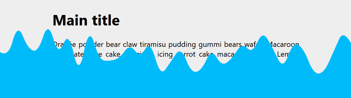
A Sliding "Liquid Oozing" Reveal Effect
Create a fancy reveal animation with a "liquid oozing" effect using the shape() function. Code generated using my wavy divider generator.
html:after {
  content: "";
  position: fixed;
  inset: 0;
  background: #219ebc;
  animation: reveal 6s 1.5s both;
}
@keyframes reveal {
  0% {
    clip-path: shape(/* code from the generator */);
  }
  to {
    translate: 0 110%;
    clip-path: shape(/* code from the generator */);
  }
}
See the Pen Sliding reveal animation by Temani Afif (@t_afif) on CodePen.
First, select the top configuration, set the granularity, and generate a shape (the shape ID). Then, you adjust the size of the wave at 0% and at 100% to get the code for both shapes.
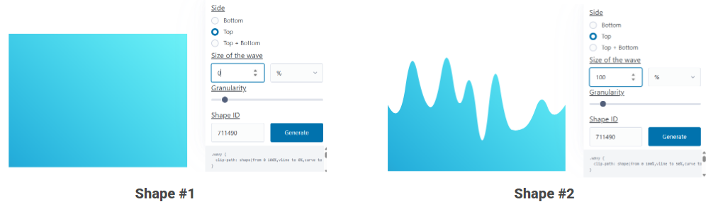
Having the same granularity and shape ID will allow the browser to have a smooth transition between both shapes and create that fancy effect.
More CSS Tips
- The Gotcha of using counter() with container counter() may behave strangely when combined with container. Learn about this small quirk.
- Add a Wobbling Animation to your Images Create an infinite fancy animation using clip-path and shape().