A Squircle Shape using clip-path: shape()
Until better support for corner-shape, we can approximate a squircle shape using clip-path: shape(). A flexible implementation using CSS variable to easily control the radius.

.squircle {
  --r: 50%; /* between 0% (square) and 50% (squircle) (You can also use pixel value) */

  --_r: clamp(0%,var(--r)/2,25%);
  --_v: calc(var(--_r)*(1 - sqrt(2)/4));
  --_p: calc(var(--_v) - var(--_r)/2);
  clip-path: shape(
    from var(--_v) var(--_p),
    curve to 50% 0 with var(--_r) 0,
    curve to calc(100% - var(--_v)) var(--_p) with calc(100% - var(--_r)) 0,
    curve to calc(100% - var(--_p)) var(--_v) with calc(100% - 2*var(--_p)) calc(2*var(--_p)),
    curve to 100% 50% with 100% var(--_r),
    curve to calc(100% - var(--_p)) calc(100% - var(--_v)) with 100% calc(100% - var(--_r)),
    curve to calc(100% - var(--_v)) calc(100% - var(--_p)) with calc(100% - 2*var(--_p)) calc(100% - 2*var(--_p)),
    curve to 50% 100% with calc(100% - var(--_r)) 100%,
    curve to var(--_v) calc(100% - var(--_p)) with var(--_r) 100%,
    curve to var(--_p) calc(100% - var(--_v)) with calc(2*var(--_p)) calc(100% - 2*var(--_p)),
    curve to 0 50% with 0 calc(100% - var(--_r)),
    curve to var(--_p) var(--_v) with 0 var(--_r),
    curve to var(--_v) var(--_p) with calc(2*var(--_p)) calc(2*var(--_p))
  );
}
In the demo below, you can adjust the radius and compare the shape() implementation with the corner-shape one.
See the Pen Squircle (shape() vs corner-shape) by Temani Afif (@t_afif) on CodePen.
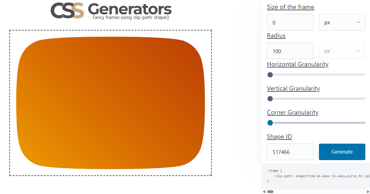
You can also generate the code using my fancy frame generator by reducing the granularity and making the frame size equal to 0.
More CSS Tips
- The Gotcha of using counter() with container counter() may behave strangely when combined with container. Learn about this small quirk.
- Add a Wobbling Animation to your Images Create an infinite fancy animation using clip-path and shape().
- The Hidden Trick of Style Queries and if() Learn the secret behind the new conditions and how to use them correctly.
- Why is Anchor Positioning not working? Learn the edge cases that prevent anchor positioning from working correctly.