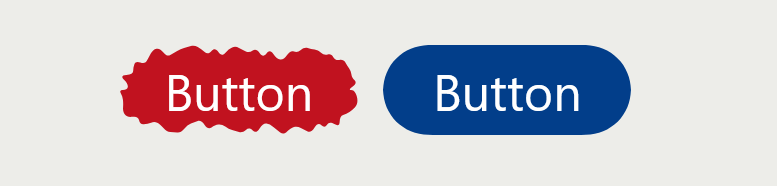
A Squishy Button with a Hover/Click Effect
Use the shape() function to create a fancy frame around a button element with a cool animation on hover and on click.
button {
  background: #c1121f;
  color: #fff;
  font-size: 50px;
  line-height: 1.8;
  transition: .3s ease-out;
  cursor: pointer;
}
button:hover {
  transition: 1s linear(/* from https://linear-easing-generator.netlify.app/ */);
}
button:active {
  transition: .25s;
}
button span {
  display: block;
  transition: inherit;
}
button:active span {
  scale: .85;
}
button {
  /* Shape #1 */
  clip-path: shape(/* from https://css-generators.com/fancy-frame/ */);
}
button:hover {
  /* Shape #2 */
  clip-path: shape(/* from https://css-generators.com/fancy-frame/ */);
}
button:active {
  /* Shape #3 */
  clip-path: shape(/* from https://css-generators.com/fancy-frame/ */);
}
See the Pen Squishy button using shape() by Temani Afif (@t_afif) on CodePen.
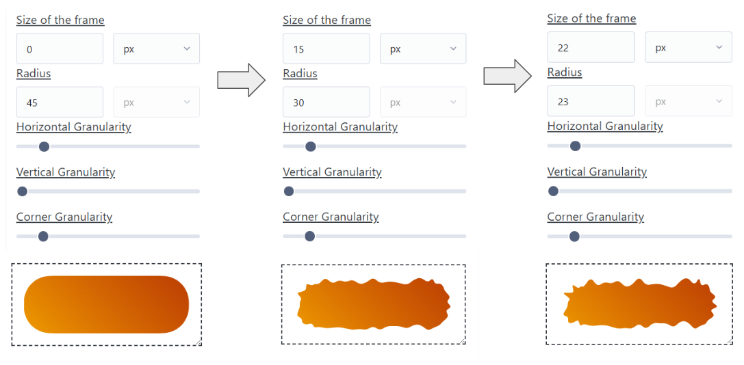
You can use my online generator to the get shape() code: css-generators.com/fancy-frame.
First, identify the height of the element (in our case, it's 90px (1.8 x 50px)). Then, take half of that value (45px). In the generator, fix the values of the granularities and the shape ID (keep the vertical granularity at the smallest value). Then, you generate the first shape by setting the size to 0 and the radius to 45. For the second shape, increase the size slightly and decrease the radius by the same amount (e.g., 15 and 30). Same thing for the third shape (e.g., 22 and 23).
The sum of the size and radius must always remain the same (45px in our case), and you should keep the same granularities. The shape ID can be different if you want another kind of animation.
More CSS Tips
- CSS-only Chrome Dino Game Recreating the famous Dino game by Google using pure CSS, and playable with the keyboard.
- The Gotcha of using counter() with container counter() may behave strangely when combined with container. Learn about this small quirk.
- A Generator for Fancy Frames Create a lot of cool frames with one generator (Squiggly, Ragged, Wiggly, Wavy, Torn, etc.).
- The Hidden Trick of Style Queries and if() Learn the secret behind the new conditions and how to use them correctly.