How to correctly use steps() with animations
You want to create a discrete animation using steps() but you struggle with its value, right? You never know how many steps it requires and it never works as expected!
In most cases, adding an extra value will fix your issue.
/* Don't ❌ */
.element {
animation: anime 3s steps(3);
}
/* Do ✅ */
.element {
animation: anime 3s steps(3,jump-none);
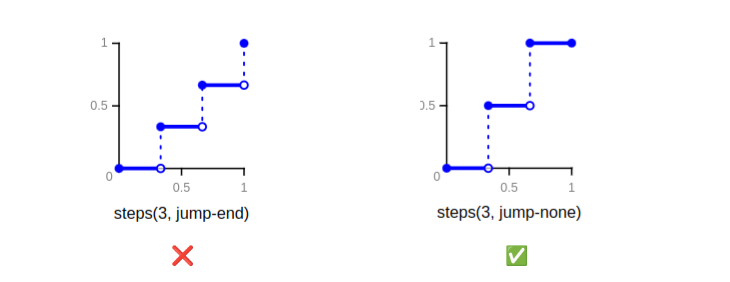
}By default, steps() uses jump-end which is not very intuitive. The behavior you are looking for is the one of jump-none
Here is a demo with some common examples (see the comments in the CSS code)
See the Pen Using steps(N,jump-none) by Temani Afif (@t_afif) on CodePen.
More CSS Tips
- Border-only breadcrumb shape using modern CSS A few lines of code to create a border-only breadcrumb shape that you can easily adjust.
- Glowing border animation with a smooth stop Add a fancy border animation on hover that stops smoothly on mouseout.
- Get the scrollbar width using only CSS A few lines of code to get the scrollbar width within a CSS variable.
- Folded rectangle shapes using CSS mask Create a folded rectangle shape with minimal code and a subtle 3D effect.