Dynamic Tooltip Position with Anchor Positioning
With anchor positioning, we can anchor an element to another and also ensure it remains visible on the screen regardless of the anchor's position. Now, imagine the element you want to anchor is a tooltip. What about its tail? We can also adjust its position to always point to the anchor.
#anchor {
position: absolute;
anchor-name: --anchor;
}
#tooltip {
--d: 1em; /* distance between anchor and tooltip */
--s: 1.2em; /* tail size */
position: absolute;
position-anchor: --anchor;
/* place tooltip at top */
position-area: top;
bottom: var(--d);
margin-top: var(--d); /* the margin is inherited by the pseudo element, it does nothing here */
/* if it doesn't fit on the top, fall back to bottom (this will flip the margin as well) */
position-try: flip-block;
anchor-name: --tooltip;
}
/* the tail */
#tooltip:before {
content:"";
position: fixed;
z-index: -1;
width: var(--s);
background: inherit;
/* vertical position from tootlip */
top: calc(anchor(--tooltip top ) - var(--d));
bottom: calc(anchor(--tooltip bottom) - var(--d));
/* horizontal position from anchor */
left: calc(anchor(--anchor center) - var(--s)/2);
margin: inherit; /* this will do the magic, it will hide either the top or the bottom of the shape */
/* the arrow shape */
clip-path: polygon(50% .2em,100% var(--d),100% calc(100% - var(--d)),50% calc(100% - .2em),0 calc(100% - var(--d)),0 var(--d));
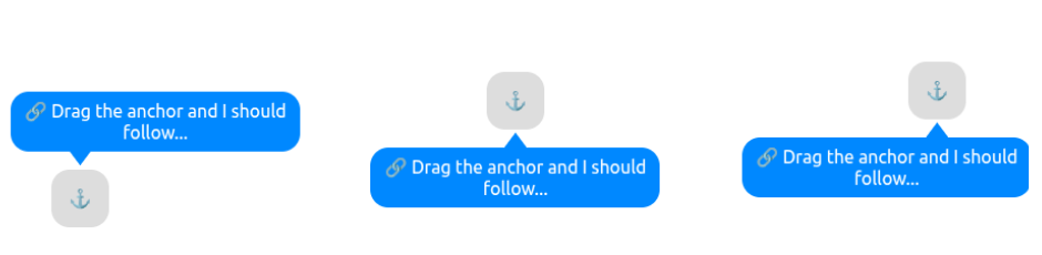
}Here is an interactive demo where you can drag the anchor and see how the tooltip behaves:
See the Pen Follow me if you can! (drag the anchor) by Temani Afif (@t_afif) on CodePen.
Click the "debug mode" to understand the trick. Both arrows are always visible, but the margin will update the position to simulate the "hide" effect.
More CSS Tips
- Alignment in Anchor Positioning using position-area An interactive demo to understand how to control the alignment using the position-area property.
- Dynamic Tooltip Position with Anchor Positioning II A tootlip that finds the best position to remain visible all the time.
- 3D Box using Modern CSS Combining corner-shape and modern CSS features to create a 3D box.
- CSS Shapes using corner-shape Recreate all the common CSS shapes using corner-shape and border-radius.