Dynamic Tooltip Position with Anchor Positioning II
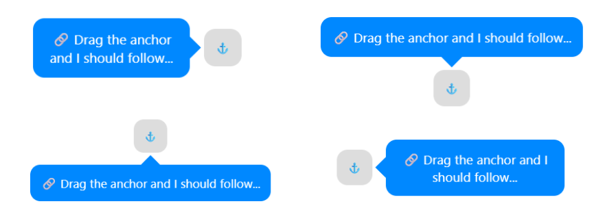
In the previous post, we created a tooltip that flips between two positions to remain visible. It's either on the top or the bottom. We can adjust the code to do the same with four positions (top, bottom, left, and right). And whatever the position of the tooltip, the tail will always point to the anchor.
#anchor {
  position: absolute;
  anchor-name: --anchor;
}
#tooltip {
  --d: 1em;  /* distance between anchor and tooltip */
  --s: .8em; /* tail size */

  position: absolute;
  position-anchor: --anchor;
  position-area: top;
  justify-self: unsafe anchor-center;
  bottom: var(--d);
  margin: var(--d);
  margin-bottom: 0;
  position-try: flip-block,--size flip-start,--size flip-start flip-inline;
}
@position-try --size {
  min-height: 12em; /* this is a min-width! */
}
#tooltip:before {
  content:"";
  position: absolute;
  z-index: -1;
  background: inherit;
  inset: calc(-1*var(--d));
  margin: inherit; /* the margin will do the magic and only show one part of the shape */
  /* the shape of the 4 arrows with one clip-path */
  clip-path: polygon(
    calc(50% - var(--s)) var(--d),50% .2em,calc(50% + var(--s)) var(--d),
    calc(100% - var(--d)) calc(50% - var(--s)), calc(100% - .2em) 50%,calc(100% - var(--d)) calc(50% + var(--s)),
    calc(50% + var(--s)) calc(100% - var(--d)),50% calc(100% - .2em),calc(50% - var(--s)) calc(100% - var(--d)),
    var(--d) calc(50% + var(--s)), .2em 50%,var(--d) calc(50% - var(--s))
  );
}
Here is an interactive demo where you can drag the anchor and see how the tooltip behaves:
See the Pen Follow me if you can! (drag the anchor) by Temani Afif (@t_afif) on CodePen.
If you click on "debug mode" you can see the global shape created with the pseudo-element that contains the four arrows.
The code can be simplified to the below if you don't want a min-width restriction:
#anchor {
  position: absolute;
  anchor-name: --anchor;
}
#tooltip {
  --d: 1em;  /* distance between anchor and tooltip */
  --s: .8em; /* tail size */

  position: absolute;
  position-anchor: --anchor;
  position-area: top;
  justify-self: unsafe anchor-center;
  bottom: var(--d);
  margin: var(--d);
  margin-bottom: 0;
  position-try: flip-block,flip-start,flip-start flip-inline;
}
#tooltip:before {
  content:"";
  position: absolute;
  z-index: -1;
  background: inherit;
  inset: calc(-1*var(--d));
  margin: inherit;
  clip-path: polygon(
    calc(50% - var(--s)) var(--d),50% .2em,calc(50% + var(--s)) var(--d),
    calc(100% - var(--d)) calc(50% - var(--s)), calc(100% - .2em) 50%,calc(100% - var(--d)) calc(50% + var(--s)),
    calc(50% + var(--s)) calc(100% - var(--d)),50% calc(100% - .2em),calc(50% - var(--s)) calc(100% - var(--d)),
    var(--d) calc(50% + var(--s)), .2em 50%,var(--d) calc(50% - var(--s))
  );
}
See the Pen Follow me if you can! (drag the anchor) by Temani Afif (@t_afif) on CodePen.
More CSS Tips
- The Universal Focus Ring Using anchor positioning to create a fancy focus ring that travels the whole page.
- Dynamic Tooltip Position with Anchor Positioning III Another idea of a tooltip following its anchor.
- Dynamic Tooltip Position with Anchor Positioning A tootlip that follows its anchor while adjusting the position of its tail.
- Range Selection using Modern CSS A new way to select elements in a specific range using if() and sibling-index().