Dynamic Tooltip Position with Anchor Positioning III
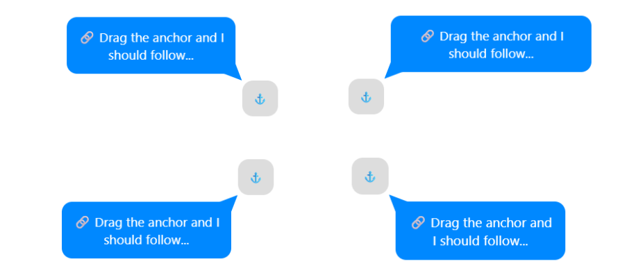
Here is another idea of implementation (after the first and second ones), where the tooltip adjusts its position to remain visible and follow its anchor. This time, I am considering the corner positions.
#anchor {
  position: absolute;
  anchor-name: --anchor;
}
#tooltip {
  --d: .5em; /* distance between anchor and tooltip */
  --s: .8em; /* tail size & border radius */

  position: absolute;
  border-radius: var(--s);
  position-anchor: --anchor;
  position-area: top left;
  margin: var(--d);
  position-try: flip-inline,flip-block,flip-block flip-inline;
  clip-path: inset(0) margin-box;
}

#tooltip:before {
  content: "";
  position: fixed;
  position-area: center;
  width:  calc(anchor-size(width) +  2*(var(--d) + var(--s)));
  height: calc(anchor-size(height) + 2*(var(--d) + var(--s)));
  background: inherit;
  z-index: -1;
  position-anchor: --anchor;
  clip-path: polygon(0 0,0 100%,100% 100%,100% 0,0 0,var(--s) 0,calc(100% - var(--s)) 0,calc(100% - var(--s) - var(--d)) calc(var(--d) + var(--s)),100% var(--s),100% calc(100% - var(--s)), calc(100% - var(--s) - var(--d)) calc(100% - var(--s) - var(--d)),calc(100% - var(--s)) 100%,var(--s) 100%,calc(var(--s) + var(--d)) calc(100% - var(--s) - var(--d)),0 calc(100% - var(--s)), 0 var(--s),calc(var(--s) + var(--d)) calc(var(--s) + var(--d)),var(--s) 0);
}
Here is an interactive demo where you can drag the anchor and see how the tooltip behaves:
See the Pen Follow me if you can! (drag the anchor) by Temani Afif (@t_afif) on CodePen.
More CSS Tips
- Responsive Circular List of Stacked/Overlapping Images Images placed around a circle with a slight overlap and a nice hover effect.
- Responsive List of Stacked/Overlapping Images A few lines of modern CSS to create a horizontal list of responsive stacked images.
- Dynamic Tooltip Position with Anchor Positioning II A tootlip that finds the best position to remain visible all the time.
- Conditional Border Radius with Modern CSS A simple trick to control the border-radius based on the screen/container size.