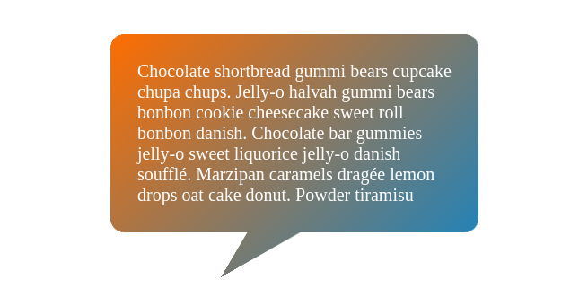
Tooltip using mask
Create a Tooltip shape with rounded corners using a few lines of code
- No extra element
- No pseudo element
- Works with any background
- Easy to control using CSS variables
.tooltip {
  --r: 30px; /* control the radius */
  --h: 50px; /* control the height of the tail */
  --p: 30%;  /* control the position of the tail */

  padding: var(--r);
  border-bottom: var(--h) solid #0000;
  mask:
    /* adjust the angles of the 1st conic-gradient to control the shape */
    conic-gradient(from 30deg at var(--p) 100%,#0000,#000 1deg 30deg,#0000 31deg)
     0 100%/100% calc(100% - var(--r)) no-repeat,
    conic-gradient(at calc(var(--r)/2) calc(var(--r)/2),#000 270deg,#0000 0)
     0 0/calc(100% - var(--r)/2) calc(100% - var(--r)/2) padding-box,
    radial-gradient(50% 50%,#000 98%,#0000)
     0 0/var(--r) var(--r) space padding-box;
}
See the Pen Rounded tooltip CSS only by Temani Afif (@t_afif) on CodePen.
Another idea with a different syntax:
.tooltip {
  --r: 30px; /* control the radius */
  --h: 50px; /* control the height of the tail */
  --p: 30%;  /* control the position of the tail */

  padding: var(--r);
  border: var(--h) solid #0000;
  border-radius: calc(var(--r) + var(--h));
  mask:
    /* adjust the angles of the 1st conic-gradient to control the shape */
    conic-gradient(from 30deg at var(--p) 100%,
        #0000, red 1deg 30deg, #0000 31deg)
      0 100%/ 100% var(--h) no-repeat border-box,
    conic-gradient(red 0 0) padding-box;
See the Pen Rounded tooltip CSS only by Ana Tudor (@thebabydino) on CodePen.
More Tooltip shapes: css-generators.com/tooltip-speech-bubble
More CSS Tips
- Wavy text animation II Use CSS gradients to create a wavy text animation.
- Wavy text animation Use CSS gradients to create a wavy text animation.
- Grid with dashed lines Two gradients to create a grid with dashed lines.
- CSS-only Zoom effect on images clip-path and transform to create a zoom effect.