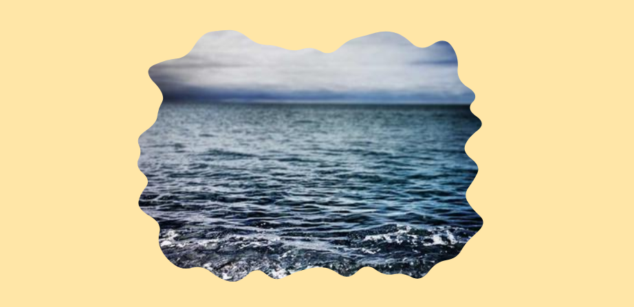
Add a Wobbling Animation to your Images
Use shape() and my fancy frames generator to create an infinite wobbling animation for images or any elements. It's a single-element implementation with simple code.
img {
  animation: shape 4s linear infinite;
}
@keyframes shape {
  0%,to {clip-path: shape(/* from the generator */)}
  33.3% {clip-path: shape(/* from the generator */)}
  66.6% {clip-path: shape(/* from the generator */)}
}
All you have to do is fix the granularity, then generate three different shapes. The same granularity will ensure the same number of curves/points, allowing the browser to have a smooth transition between the shapes.
See the Pen Untitled by Temani Afif (@t_afif) on CodePen.
More CSS Tips
- A Sliding "Liquid Oozing" Reveal Effect A fancy reveal animation powered by clip-path: shape().
- CSS-only Chrome Dino Game Recreating the famous Dino game by Google using pure CSS, and playable with the keyboard.
- A Squircle Shape using clip-path: shape() Using the shape() function to approximate the classic squircle shape.
- A Generator for Fancy Frames Create a lot of cool frames with one generator (Squiggly, Ragged, Wiggly, Wavy, Torn, etc.).