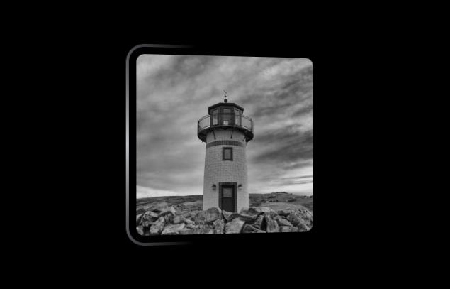
3D shine animation with a hover effect
Add a fancy 3D animation to your image with a cool hover effect
- No extra element (only the
<img>tag) - No pseudo-element
- Optimized with CSS variables
img {
  --c: #bec1c9; /* the main coloration of the rotating gradient */
  width: 250px; /* the size of the image*/
  aspect-ratio: 1;
  border-radius: 25px;
  border: 4px solid #0000; /* the thickness for the rotating gradient */
  padding: 10px; /* the gap */
  background:
    conic-gradient(from var(--a),
       #0000 calc(30% - var(--p)),
       var(--c) calc(50% - var(--p)) calc(50% + var(--p)),
       #0000 calc(70% + var(--p))) border-box;
  --g: linear-gradient(#000 0 0);
  mask:
    var(--g),var(--g) padding-box,
    conic-gradient(from var(--a),
       #000d calc(30% - var(--p)),
       #000  calc(50% - var(--p)) calc(50% + var(--p)),
       #000d calc(70% + var(--p))) content-box;
  mask-composite: exclude;
  --_t: perspective(450px); /* the bigger, the better */
  animation: 4s linear infinite;
  animation-name: a,r;
  transition: --p .5s,--r .4s;
}
img:hover {
  --p: 50%;
  --r: 0deg;
  animation-play-state: paused;
}
@keyframes a {
  to {--a: 405deg}
}
@keyframes r{
  0%,
  100%  {transform: var(--_t) rotate3d( 1, 1,0,var(--r))}
  12.5% {transform: var(--_t) rotate3d( 0, 1,0,var(--r))}
  25%   {transform: var(--_t) rotate3d(-1, 1,0,var(--r))}
  37.5% {transform: var(--_t) rotate3d(-1, 0,0,var(--r))}
  50%   {transform: var(--_t) rotate3d(-1,-1,0,var(--r))}
  62.5% {transform: var(--_t) rotate3d( 0,-1,0,var(--r))}
  75%   {transform: var(--_t) rotate3d( 1,-1,0,var(--r))}
  87.5% {transform: var(--_t) rotate3d( 1, 0,0,var(--r))}
}
See the Pen 3D shine animation with hover effect by Temani Afif (@t_afif) on CodePen.
More CSS Tips
- 3D trailing shadows for images A simple trick to add a 3D shadow to your images.
- A reveal hover effect with an expanding circle A simple but nice hover effect to reveal your image.
- Sliding reveal animation for your images A cool reveal effect on hover with a sliding animation.
- Color your image with a sliding hover effect Reveal the color of a black & white image using a simple code.