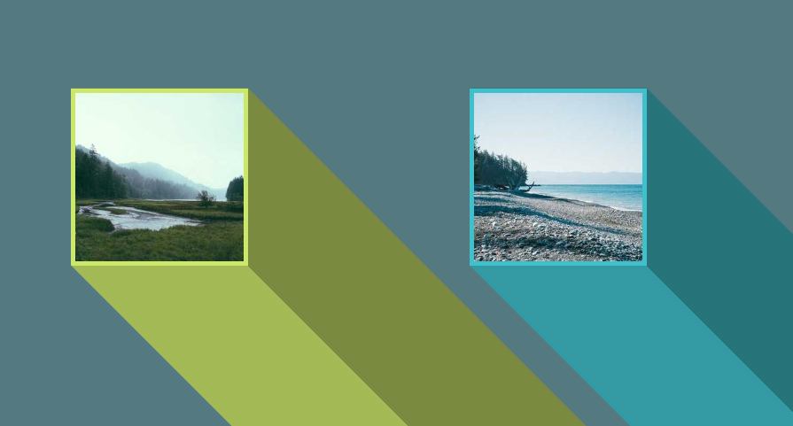
3D trailing shadows for images
Add a 3D trailing shadow to your image with a few lines of code
- No extra element (only the
<img>tag) - No pseudo-element
- Less than 10 CSS declarations
- No scrollbar issue
img {
  --c: #CBE86B; /* the main color */
  --t: 5px; /* thickness of the outline */

  width: 200px; /* the image size */
  aspect-ratio: 1; /* only square images, don't change this */
  border-image:
    linear-gradient(45deg,
      color-mix(in srgb,var(--c),#000 20%) 50%,
      color-mix(in srgb,var(--c),#000 40%) 0)
     fill 0//9999px;
  clip-path:
    polygon(0 100%,0 0,100% 0,
      calc(100% + 9999px) 9999px,
      9999px calc(100% + 9999px));
  outline: var(--t) solid var(--c);
  outline-offset: calc(-1*var(--t));
}
See the Pen 3D trailing shadow for images by Temani Afif (@t_afif) on CodePen.
Related: smashingmagazine.com/2024/01/css-border-image-property/
More CSS Tips
- Zoom effect on hover A few lines of code to add for a zoom effect on hover.
- Corner-only borders with hover effect A simple trick to add corner-only borders to your image.
- A CSS-only array of colors Create an array of colors and use an index to navigate.
- 3D shine animation with a hover effect a fancy 3D animation to your image with a cool hover effect.