Responsive ASCII Arts using text-fit
Using the new text-fit property, you can easily make your ASCII art responsive with a simple code!
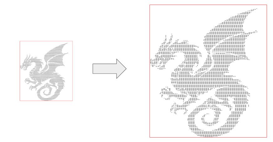
.box {
  white-space: pre; /* preserve the white spaces */
  font-size: 30px; /* use a big font-size */
  text-fit: shrink; /* allow the font-size to shrink when the box is small */
}
Resize the box in the demo below and see the magic in play!
⚠️ (Chromium only for now) ⚠️
See the Pen Responsive ascii art by Temani Afif (@t_afif) on CodePen.
Art taken from: https://emojicombos.com/ascii-art
As its name suggests, the text-fit property allows the text to fit the container by scaling the font size. We generally reach for the grow value to fill that little space at the end of each line. shrink is more useful when you want to scale down an overflowing text.
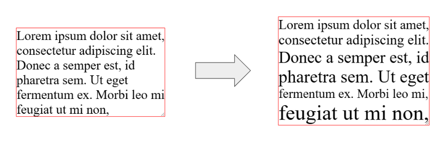
We can have the same scaling factor for all the lines (it's the default behavior). It keeps the font size the same for all lines, but we still have blank spaces. Useful for responsive ASCII arts.
.box {
  text-fit: [shrink | grow] consistent; /* consistent can be omitted */
}
Or use a different scaling factor per line. All the spaces are filled, and we have a different font-size per line.
.box {
  text-fit: [shrink | grow] per-line;
  /* OR  */
  text-fit: [shrink | grow] per-line-all; /* to include the last line */
}
Here is a demo where you can switch between the different values. Resize the box to better see the effect of each one:
See the Pen testing text-fit by Temani Afif (@t_afif) on CodePen.
More CSS Tips
- background-clip is getting an upgrade! Learn about the new values of the background-clip property.
- Wiggly/Wavy Input Range Slider II Adding a bouncy tooltip to the wiggly slider.