background-clip is getting an upgrade!
As we saw in a pervious post, the new value border-area of background-clip allows us to define a gradient border with simple code.
.gradient-border {
  border: 10px solid #0000;
  background: linear-gradient(#90e0ef,#f4a261) border-area;
}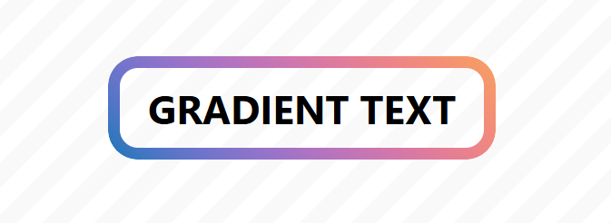
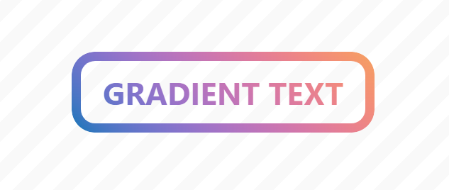
That value can also be combined with the text value to apply the gradient to the text. A simple way to have a text and border gradient while leaving the background transparent.
.gradient-text-border {
  border: 10px solid #0000;
  color: #0000;
  background: linear-gradient(#90e0ef,#f4a261) border-area text;
}
⚠️ Support is still limited (Chrome-only starting from V150) ⚠️
See the Pen Gradient text & border by Temani Afif (@t_afif) on CodePen.
The longhand version looks like the one below.
.gradient-text-border {
  border: 10px solid #0000;
  color: #0000;
  background-image: linear-gradient(#FF4E50,#40C0CB);
  background-clip: border-area text;  /* Two values */
  background-origin: border-box;
}
Note that background-origin is by default equal to border-box in the shorthand version when specifying border-area. In the longhand version, you need to set it explicitly to border-box; otherwise, it defaults to padding-box, which makes the gradient a bit off.
More CSS Tips
- Responsive ASCII Arts using text-fit Thanks to a new CSS property, it's now easy to create responsive ASCII art.
- Responsive Separator for Horizontal List Modern CSS solves a very old design pattern with a few lines of code.
- Wiggly/Wavy Input Range Slider Say goodbye to the boring straight range slider and say hello to the fancy wiggly range slider.