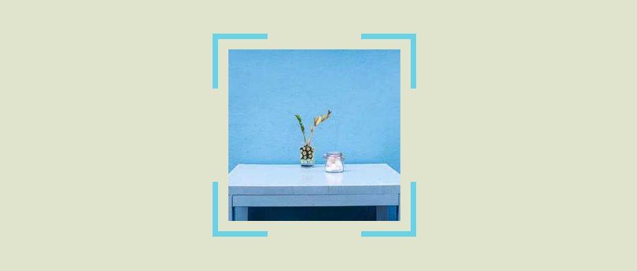
Corner-only border around an image
Create a corner-only border around an image (or any element) using a few lines of code.
- No extra element
- No Pseudo-element
- Only three properties

img {
  --s: 80px; /* corner size */
  padding: 15px; /* the gap */
  border: 8px solid #69D2E7;
  mask:
    conic-gradient(at var(--s) var(--s),#0000 75%,#000 0)
     0 0/calc(100% - var(--s)) calc(100% - var(--s)),
    conic-gradient(#000 0 0) content-box;
}
See the Pen Corner-only borders by Temani Afif (@t_afif) on CodePen.
Another idea: Corner-only borders with hover effect
More CSS Tips
- Progress bar with dynamic coloration Create a scrolling shadow effect using only CSS gradients.
- One column to control the height of another Make one column control the height of another one with a simple property.