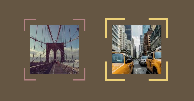
Corner-only borders with hover effect
Add corner-only borders to your images with a nice hover effect
- No extra element (only the
<img>tag) - No pseudo-element
- Less than 10 CSS declarations
- Only 2 gradients
img {
  --s: 50px; /* the size on the corner */
  --t: 5px;  /* the thickness of the border */
  --g: 20px; /* the gap between the border and image */

  padding: calc(var(--g) + var(--t));
  outline: var(--t) solid #B38184; /* the color here */
  outline-offset: calc(-1*var(--t));
  mask:
    conic-gradient(at var(--s) var(--s),#0000 75%,#000 0)
     0 0/calc(100% - var(--s)) calc(100% - var(--s)),
    conic-gradient(#000 0 0) content-box;
  transition: .4s;
}
img:hover {
  outline-offset: calc(-1*var(--g));
}
See the Pen Corner-only borders with hover effect by Temani Afif (@t_afif) on CodePen.
More detail: verpex.com/blog/website-tips/css-effects-on-images-ii
More CSS Tips
- A reveal hover effect using CSS mask Use CSS mask to create a nice reveal effect on hover.
- A color wheel with an array of colors A simple conic-gradient() trick to create a color wheel.
- 3D trailing shadows for images A simple trick to add a 3D shadow to your images.
- A reveal hover effect with an expanding circle A simple but nice hover effect to reveal your image.