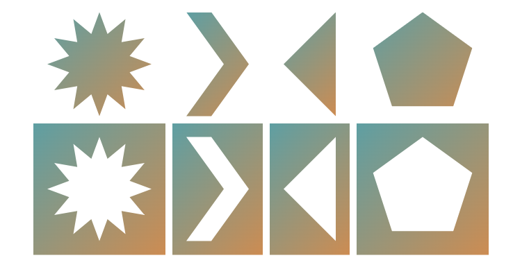
Cut-out shapes using clip-path
A simple code to invert any kind of shape created using clip-path: polygon(). An easy way to create Cut-out shapes.

.shape {
  --shape: X0 Y0, X1 Y1, X2 Y2, ... , Xn Yn, X0 Y0; /* the first value is repeated */

  /* the main shape */
  clip-path: polygon(var(--shape));
}
.shape.invert {
  --s: -20px; /* Control the space */
  padding: calc(-1*var(--s));
  /* the inverted shape */
  clip-path: polygon(evenodd,var(--s) var(--s),calc(100% - var(--s)) var(--s),calc(100% - var(--s)) calc(100% - var(--s)),var(--s) calc(100% - var(--s)),var(--s) var(--s),var(--shape)) content-box;
}
The first part before var(--shape) is static. It's the same for all the shapes, you don't need to change it. Don't forget the content-box at the end!
See the Pen Untitled by Temani Afif (@t_afif) on CodePen.
More detail: verpex.com/blog/website-tips/how-to-create-cut-out-shapes-using-the-clip-path-property
More CSS Tips
- Circular progress using scroll-driven animations Transforming the native progress element into a circular one using scroll-driven animations.
- Grainy texture using CSS gradients A simple code to create a random-style background to simulate a grainy texture.
- Better text wrapping using text-wrap The text-wrap property allows you to control how text is wrapped.
- Custom range slider with tooltip Using modern CSS features to create a fancy range slider with tooltop.