Grainy texture using CSS gradients
Create a random-style background (grainy texture) using a few lines of code.
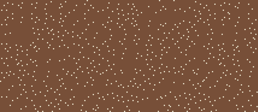
html {
  --s: 6px; /* control the size */

  --g: repeating-conic-gradient(#774F38 0 25%,#ECE5CE 0 50%) 0/;
  background:
    var(--g) calc(1*var(--s)) calc(7*var(--s)),
    var(--g) calc(2*var(--s)) calc(5*var(--s)),
    var(--g) calc(3*var(--s)) calc(3*var(--s)),
    var(--g) calc(5*var(--s)) calc(2*var(--s)),
    var(--g) calc(7*var(--s)) calc(1*var(--s));
  background-blend-mode: darken;
}
See the Pen Random CSS background by Temani Afif (@t_afif) on CodePen.
Another example
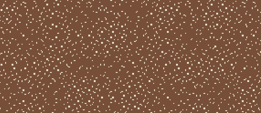
See the Pen grainy-random CSS background II by Temani Afif (@t_afif) on CodePen.
More CSS Tips
- Border gradient with border-radius The modern way to add gradient to borders while having rounder corners.
- Inverted border-radius using CSS mask One property and 4 gradients to invert the corner of any element with a radius.
- Cut-out shapes using clip-path Invert any kind of polygon shapes following simple steps.
- Custom range slider with tooltip II Using modern CSS features to create a fancy range slider with tooltop.