Get Grid Information using pure CSS II
Extending the previous implementation to consider a responsive grid with a random configuration. Each item can span multiple rows/columns and get placed anywhere on the grid.
Whatever the placement, we can retrieve the position of each item using pure CSS. A task made possible using Scroll-Driven animations!
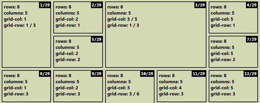
Here is an interactive demo where each item shows all the information it gets (number of columns, number of rows, position, index/number of items). Resize the demo and see how all the values adjust in real time.
⚠️ (Chromium-only for now) ⚠️
See the Pen Grid information (chrome-only) by Temani Afif (@t_afif) on CodePen.
All the values are integers, so it was an easy task to use counters and show them:
.container > * {
  /* number of column */
  --n: ...;
  /* number of rows */
  --m: ...;
  /* column start/end */
  --col-s: ...;
  --col-e: ...;
  /* row start/end */
  --row-s: ...;
  --row-e: ...;
}
.container > *:before {
  content: "rows: " counter(m) "\A columns: " counter(n)
     "\A grid-col: " counter(col-s) if(style(--col-e > calc(var(--col-s) + 1)): " / " counter(col-e);else: ;)
     "\A grid-row: " counter(row-s) if(style(--row-e > calc(var(--row-s) + 1)): " / " counter(row-e);else: ;);
  counter-reset: n var(--n) m var(--m)
    col-s var(--col-s) col-e var(--col-e)
    row-s var(--row-s) row-e var(--row-e);
}
.container > *:after {
  content: counter(i) "/" counter(n);
  counter-reset: i sibling-index() n sibling-count();
}
More CSS Tips
- Random Blob Shapes Combining shape() and random() to create unique blob shapes.
- Complex border-only Shapes with Gradient Coloration Using border-shape with border-area to easily create border-only shapes.
- Get Grid Information using pure CSS With a few lines of code, you can get the number of columns, number of rows, and item coordinates.
- Breakout Background using Modern CSS Use border-shape or border-image to extend the background color to the edge of the screen.