Hover Proximity with Scroll-Driven Animations
Hover proximity? It's when you affect the hovered element and a few surrounding elements. A fancy effect made possible using modern CSS.
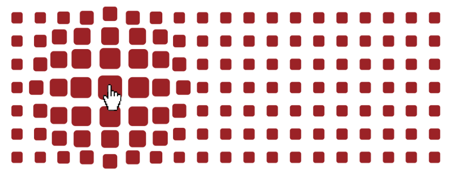
⚠️ (Chromium-only for now) ⚠️
See the Pen Hover Proximity with scroll-driven animations by Temani Afif (@t_afif) on CodePen.
We first define a responsive grid structure and calculate the coordinates of each element:
.container {
  --s: 50px; /* size */
  --g: 0px;  /* gap */

  display: grid;
  grid-template-columns: repeat(auto-fill,minmax(var(--s),1fr));
  gap: var(--g);
  container-type: inline-size;
}
.container > * {
  /* number of columns */
  --n: round(down,(100cqw + var(--g))/(var(--s) + var(--g)));
  /* number of rows */
  --m: round(up,sibling-count()/var(--n));

  /* coordinates */
  --x: round(down,(sibling-index() - 1)/var(--n));
  --y: mod(sibling-index() - 1,var(--n));
}
Then, we calculate the coordinates of the hovered element using Scroll-Driven animations:
.container {
  overflow: hidden;
  timeline-scope: --_i,--_j;
  animation: --_i linear both,--_j linear both;
  animation-timeline: --_i,--_j;
  animation-range: entry 100% exit 0%;
}
@keyframes --_i { 0% {--_i: 1} to {--_i: 0}}
@keyframes --_j { 0% {--_j: 1} to {--_j: 0}}

.container > * {
  /* coordinates  of the hovered item */
  --i: round(var(--_i)*(var(--m) - 1));
  --j: round(var(--_j)*(var(--n) - 1));
}
.container > *:hover {
  view-timeline: --_j x,--_i y;
}
Finally, we apply some conditional CSS:
.container > *:before {
  /* calculate the distance between each element and the hovered element */
  --_d: hypot(var(--x) - var(--i),var(--y) - var(--j));
  /* use the distance to apply conditional CSS */
  translate: if(
    style(--_d <= 3):
      calc(sign(var(--y) - var(--j))*max(0px,15px - var(--_d)*2px))
      calc(sign(var(--x) - var(--i))*max(0px,15px - var(--_d)*2px));
    else: 0 0;
   );
  scale: max(.7,1.5 - .2*var(--_d));
}
A bit lost? Stay tuned for a detailed article explaining the technique. A technique we can use to create many cool demos!
See the Pen Hover Proximity with scroll-driven animations by Temani Afif (@t_afif) on CodePen.
See the Pen highlight same row and column on hover by Temani Afif (@t_afif) on CodePen.
See the Pen highlight diagonal on hover by Temani Afif (@t_afif) on CodePen.
More CSS Tips
- Complex border-only Shapes with Gradient Coloration Using border-shape with border-area to easily create border-only shapes.
- Dynamic Node Connection (CSS-only Diagram) II More node connections using border-shape and modern CSS.
- Breakout Background using Modern CSS Use border-shape or border-image to extend the background color to the edge of the screen.
- A New Way to Round the Corners of CSS Shapes Learn how to round the corners of any shape with a simple code.