Heart shape with a sliding hover effect
Turn your image into a heart shape with a lovely hover animation 😍
- No extra element (only the
<img>tag) - No pseudo-elements
- Less than 15 CSS declarations
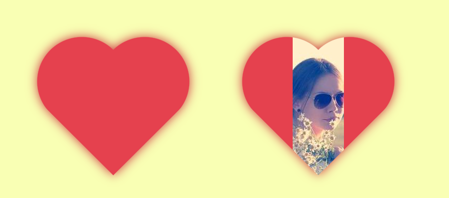
img {
  --s: 300px; /* image size */

  width: var(--s);
  padding: calc(var(--s)/2);
  box-sizing: border-box;
  background: #e5414e; /* heart color */
  aspect-ratio: 1;
  object-fit: cover;
  mask-border: radial-gradient(#000 69%,#0000 70%) 84.5%/50%;
  clip-path: polygon(-41% 0,50% 91%, 141% 0);
  transition: .6s padding-block, padding-inline 0s .6s;
}
img:hover {
  padding: 0;
  transition: .6s padding-inline, padding-block 0s;
}
See the Pen Heart shape image reveal ❤️ by Temani Afif (@t_afif) on CodePen.
Related Article: verpex.com/blog/website-tips/css-shapes-the-heart
More CSS Tips
- Create a flower shape using CSS mask Use an online generator to create a fancy flower shape using mask.
- Be careful when using the nesting selector (&) The "&" selector is not the same in CSS and Sass so use it carefully.
- Responsive full-screen slanted coloration Three CSS properties for a fancy full width responsive coloration.
- When to use the min() or max() function a quick trick to know when to use min() or max().