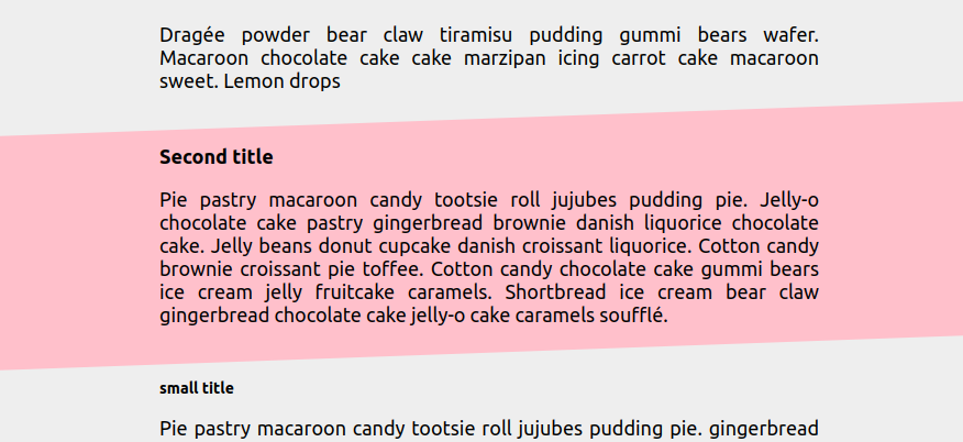
Responsive full-screen slanted coloration
Use modern CSS to:
- Set a max-width
- Center an element
- Set a minimum margin
- Add a full-width slanted coloration
- Make the slant effect responsive
All of this, using only 3 properties and easy to control with CSS variables
section {
  --w: 800px; /* max-wdith */
  --s: 2rem;  /* control the slanted effect */
  --c: pink;

  margin: var(--s,0) max(1rem,50% - var(--w)/2);
  border-image: fill 0//99vw conic-gradient(var(--c) 0 0);
  --_s: clamp(0px,(100vw - var(--w))*999,var(--s)/2);
  clip-path: margin-box
    polygon(
      0    calc(var(--s)/2 + var(--_s)),
      100% calc(var(--s)/2 - var(--_s)),
      100% calc(100% - var(--s)/2 - var(--_s)),
      0    calc(100% - var(--s)/2 + var(--_s))
    );
}
Resize the screen to see the responsive part of the slant effect
See the Pen Slanted responsive coloration by Temani Afif (@t_afif) on CodePen.
More CSS Tips
- Heart shape with a sliding hover effect II A lovely animation to your heart shape image.
- Heart shape with a sliding hover effect A lovely animation to your heart shape image.
- An infinite number of borders around images A border-image trick to add as many number of borders as you want.
- A curved ribbon shape with hover effect A simple ribbon shape with a fancy hover effect.