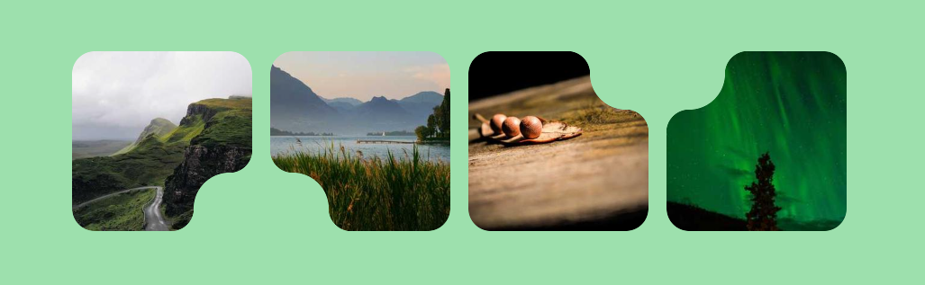
Inverted border-radius using CSS mask
Use CSS mask to create an inverted radius corner with a minimal code.
- No extra elements
- No pseudo-elements
- Optimized with CSS variables
img {
  --r: 25px; /* radius */
  --s: 40px; /* size of the inner curve */

  border-radius: var(--r);
  --_m:/calc(2*var(--r)) calc(2*var(--r)) radial-gradient(#000 70%,#0000 72%) no-repeat;
  mask:
    right calc(var(--s) + var(--r)) top 0 var(--_m),
    right calc(var(--s) + var(--r)) var(--_m),
    radial-gradient(var(--s) at 100% 0,#0000 99%,#000 calc(100% + 1px))
     calc(-1*var(--r)) var(--r) no-repeat,
    conic-gradient(at calc(100% - var(--s) - 2*var(--r)) calc(var(--s) + 2*var(--r)),
     #0000 25%,#000 0);
}
See the Pen Inverted border-radius using CSS mask by Temani Afif (@t_afif) on CodePen.
Here is a different syntax if you want to control the offset of the inner curve.
img {
  --r: 20px; /* radius */
  --s: 40px; /* size of the inner curve */
  --x: 25px; /* horizontal offset (no percentange) */
  --y: 5px;  /* vertical offset (no percentange) */

  border-radius: var(--r);
  --_m:/calc(2*var(--r)) calc(2*var(--r)) radial-gradient(#000 70%,#0000 72%);
  --_g:conic-gradient(at calc(100% - var(--r)) var(--r),#0000 25%,#000 0);
  --_d:(var(--s) + var(--r));
  mask:
    calc(100% - var(--_d) - var(--x)) 0 var(--_m),
    100% calc(var(--_d) + var(--y)) var(--_m),
    radial-gradient(var(--s) at 100% 0,#0000 99%,#000 calc(100% + 1px))
     calc(-1*var(--r) - var(--x)) calc(var(--r) + var(--y)),
    var(--_g) calc(-1*var(--_d) - var(--x)) 0,
    var(--_g) 0 calc(var(--_d) + var(--y));
  mask-repeat: no-repeat;
}
See the Pen Inverted border-radius using CSS mask II by Temani Afif (@t_afif) on CodePen.
More CSS Shapes: css-shape.com
More CSS Tips
- Typed CSS variables using @property Upgrade your CSS variables by registering them using the @property.
- Get the screen width & height without JavaScript A few lines of CSS to get the screen width/height as integer values.
- Grainy texture using CSS gradients A simple code to create a random-style background to simulate a grainy texture.
- Fancy hover effect with anchor positioning Create a navigation menu with a cool hover effect.