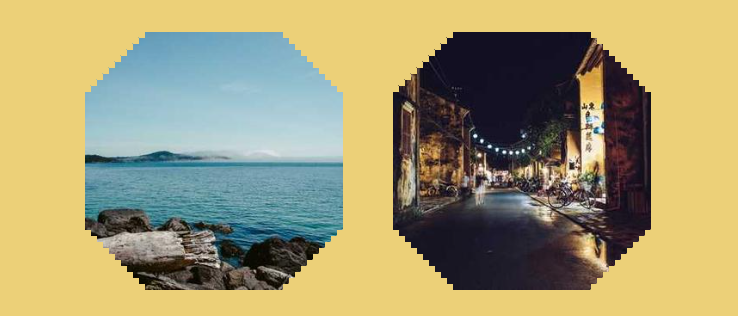
CSS-Only pixelated cut corners
Use modern CSS to cut the corner of an image with a pixelated effect.
- Only one element (the
<img>tag) - Only 4 properties
- Optimized with CSS variables
img {
  --n: 5;     /* the granularity */
  --s: 12px;  /* control the pixel size */
  --w: 280px; /* the image size */

  width: calc(round(var(--w),var(--s)) + var(--s)/2);
  aspect-ratio: 1;
  --_m:#0000 calc((var(--s)*(var(--n) + .5))/sqrt(2)),
       #000 0 calc(100% - (var(--s)*(var(--n) + .5))/sqrt(2)),
       #0000 0;
  clip-path: polygon(
    50% calc(var(--s)*var(--n) - 50%),
    calc(150% - var(--s)*var(--n)) 50%,
    50% calc(150% - var(--s)*var(--n)),
    calc(var(--s)*var(--n) - 50%) 50%);
  mask:
    repeating-conic-gradient(#0000 0 25%,#000 0 50%)
     0 0/var(--s) var(--s),
    linear-gradient(-45deg,var(--_m)) intersect,
    linear-gradient( 45deg,var(--_m));
}
See the Pen CSS-only pixelated cut corner by Temani Afif (@t_afif) on CodePen.
More CSS Tips
- Write better CSS with modern CSS Optimize your code and reduce redundancy using modern CSS..
- A fancy frame with Zig-Zag borders Use modern CSS to create a Zig-Zag box.
- Fluid typography with discrete steps Improve your fluid typography implementation using the round() function.
- A CSS-only wavy divider Use modern CSS and few lines of code to create a cool divider.