A Modern way to create a star shape
Create a Star shape using clip-path and only 5 points instead of 10.
Three different codes to create the same shape
- Precise version using math
- Calculated version without math
- Simplified version with easier coordinates values

/* Accurate version with precise values */
.one {
aspect-ratio: 1;
clip-path: polygon(50% 0,
calc(50%*(1 + sin(.4turn))) calc(50%*(1 - cos(.4turn))),
calc(50%*(1 - sin(.2turn))) calc(50%*(1 - cos(.2turn))),
calc(50%*(1 + sin(.2turn))) calc(50%*(1 - cos(.2turn))),
calc(50%*(1 - sin(.4turn))) calc(50%*(1 - cos(.4turn)))
);
}
/* A simplified version of the previous one.
We do the calculation and we round the result */
.two {
aspect-ratio: 1;
clip-path: polygon(50% 0,79% 90%,2% 35%,98% 35%,21% 90%);
}
/* Another simplification with easier clip-path values
It covers a bigger area of the element */
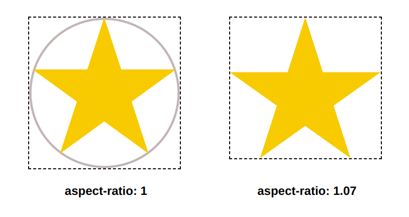
.three {
aspect-ratio: 1.07;
clip-path: polygon(50% 0,80% 100%,0 39%,100% 39%,20% 100%);
}The first and second methods consider the inscribed circle of a square to draw the points while the third method considers the smallest rectangle that can contain the star shape.
See the Pen Modern ways to create a Star shape by Temani Afif (@t_afif) on CodePen.
More detail: smashingmagazine.com/2024/05/modern-guide-making-css-shapes
More CSS Tips
- Create CSS Shapes with a single element An online resource to grab the code of any CSS shape with one click.
- Write better CSS with modern CSS Optimize your code and reduce redundancy using modern CSS..
- Rounded tabs with inner curves A few lines of code to get rounded tabs using CSS mask.
- Fluid typography with discrete steps Improve your fluid typography implementation using the round() function.