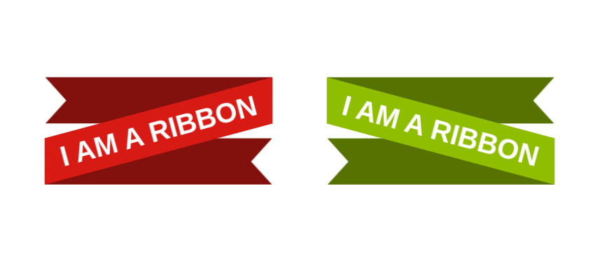
Rotated Ribbon Shape with hover effect
Place your title into a fancy Ribbon Shape with a cool hover effect 😍
- Only one element
- Optimized with CSS variables
- Powered by modern CSS features 💪
@property --a {
  syntax: "<angle>";
  initial-value: 0deg;
  inherits: true;
}

h1 {
  --r: 30px;  /* control the cutout of the ribbon */
  --a: 15deg; /* control the angle (only positive values) */
  --c: #d81a14;

  line-height: 1.6; /* this will control the height */
  padding-inline: .5lh;
  color: #fff;
  background:
    linear-gradient(calc(90deg + var(--a)),
      #0000 calc(1lh*sin(var(--a)) - 1px),
      var(--c) calc(1lh*sin(var(--a))) calc(100% - 1lh*sin(var(--a))),
      #0000 calc(100% - 1lh*sin(var(--a)) + 1px)
    );
  position: relative;
  rotate: calc(-1*var(--a));
  transform-style: preserve-3d;
  transition: --a .5s;
  cursor: pointer;
}
h1:before,
h1:after{
  content: "";
  position: absolute;
  transform: translate3d(0,0,-1px);
  rotate: var(--a);
  height: calc(1lh/cos(var(--a)));
  width: calc(100%*cos(var(--a)) - 1lh*sin(var(--a))) ;
  background: color-mix(in srgb,var(--c),#000 40%);
  pointer-events: none;
}
h1:before {
  right: 0;
  top: 0;
  transform-origin: top right;
  clip-path: polygon(0 0,100% 0,100% 100%,0 100%,var(--r) 50%);
}
h1:after {
  left: 0;
  bottom: 0;
  transform-origin: bottom left;
  clip-path: polygon(0 0,100% 0,calc(100% - var(--r)) 50%,100% 100%,0 100%);
}
h1:hover {
  --a: 0deg;
}
See the Pen Rotated Ribbon with a cool hover effect by Temani Afif (@t_afif) on CodePen.
More Ribbon Shapes: css-generators.com/ribbon-shapes
More CSS Tips
- An Infinite Ribbon Shape for your title Transform your title into an infinite ribbon shape using CSS.
- Responsive multi-line Ribbon Shape A few gradient tricks to create a responsive ribbon shape.
- A Fancy Hover Effect For Your Avatar III Create a stunning "Pop out" hover effect using modern CSS.
- Slanted underline with hover effect A simple code to add a slanted underline to your text.