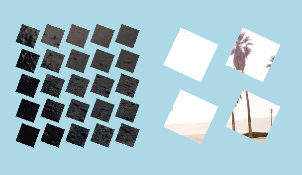
A fancy hover effect with rotating squares
Add a fancy hover effect to your image with a small code. Transform your image into little rotating squares!
- One element (the
<img>tag) - No pseudo-element
- Powered by CSS mask and @property
Pay attention to the support of the @property.
img {
  --n: 5; /* number of squares */

  --_g: #0000 var(--d,0%),#000 0;
  mask:
    linear-gradient(calc(  0deg + var(--r,0deg)),var(--_g)),
    linear-gradient(calc( 90deg + var(--r,0deg)),var(--_g)),
    linear-gradient(calc(-90deg + var(--r,0deg)),var(--_g)),
    linear-gradient(calc(180deg + var(--r,0deg)),var(--_g));
  mask-size: calc(100%/var(--n)) calc(100%/var(--n));
  mask-composite: intesect;
  outline: 100vmax solid #0009;
  outline-offset: -100vmax;
  transition: outline-color .5s;
  cursor: pointer;
}
img:hover {
  --d: 0.1%;
  --r: 90deg;
  outline-color: #0000;
  transition: outline-color .3s .2s, --d .5s cubic-bezier(0,450,1,450),--r .5s linear;
}
See the Pen A fancy CSS-only hover effect by Temani Afif (@t_afif) on CodePen.
Related links: #
- css-tricks.com/advanced-css-animation-using-cubic-bezier
- css-tricks.com/fancy-image-decorations-masks-and-advanced-hover-effects
More CSS Tips
- Select all elements between two class names A simple selector to select all the elements between two given classes.
- A reveal hover effect with a single element II Add a reveal animation to your image with a minimal code.
- A CSS-only 3D Zig-Zag edge A simple code to create a cool Zig-Zag edge with a 3D effect.
- Select the first & last element with a class Two methods to select the first & last element with a specific class.