Fancy Rounded frame around your images
Add a nice frame around your image using a few lines of code
- One element (The
<img>tag) - No pseudo-element
- Only 3 CSS properties
- Optimized with CSS variables
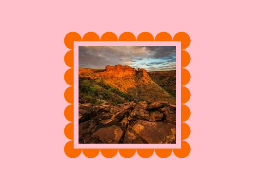
img {
  --s: 20px;    /* size of the frame */
  --g: 10px;    /* the gap */
  --c: #FA6900;

  padding: calc(var(--g) + var(--s));
  background:
    radial-gradient(farthest-side,var(--c) 97%,#0000)
    0 0/calc(2*var(--s)) calc(2*var(--s)) round;
  mask:
    conic-gradient(from 90deg at calc(2*var(--s)) calc(2*var(--s)),#0000 25%,#000 0)
     calc(-1*var(--s)) calc(-1*var(--s)),
    linear-gradient(#000 0 0) content-box;
}
See the Pen Cool frame image by Temani Afif (@t_afif) on CodePen.
More detail: css-tricks.com/fancy-image-decorations-masks-and-advanced-hover-effects
More CSS Tips
- A border-only Tooltip using mask & clip-path Use CSS mask & clip-path to create a border-only tooltip with a gradient coloration.
- A rainbow gradient animation Use the new color interpolation to create an infinite rainbow gradient animation.
- A CSS-only wavy shapes Combine gradients and CSS mask to create a wavy shape with a little of code.
- An infinite image slider A minimal code to create an infinite image slider.